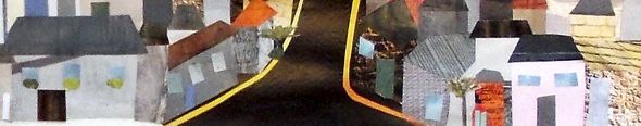
The Spring Show 2020
Opened 6pm on Saturday 25th April
Covid-19 has prevented the Society holding its traditional springtime Open Exhibition. In its place we have mounted an on-line Spring Show – 150 pictures and two 3D works from 55 of our Members.
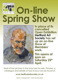
Click here to view the Spring Show
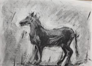
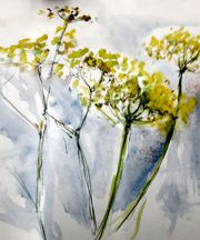
Demonstration by David Hyde - Landscape in loose watercolours
10th March 2020
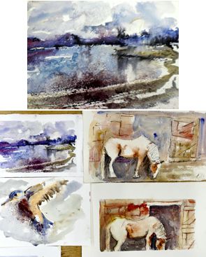
David Hyde lives and works in St. Ives, Cambridgeshire. He has exhibited widely, demonstrated at national art shows and runs and teaches watercolour painting. For David to choose to do a demonstration in loose watercolour was exceedingly brave. Not least is the issue of drying but also the fact that David was working with his board upright on the easel. Normally he would work on a shallow slant. He opted for a snowy landscape of a bridge, river, trees, reeds and a couple of small figures. The photograph had been taken somewhere in Cambridgeshire and David had already stretched the paper and lightly drawn in the view. He used Bockingford watercolour paper which is his normal choice for demonstrations, Arches being his preference for commissions etc.
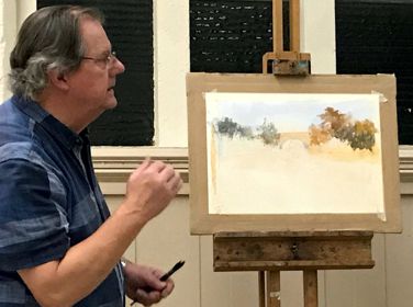
David had already drawn out the composition and talked at some length about it. He had changed it somewhat to suit his plan, less sky, more foreground and more trees. “There needs to be a focal point with lines and angles to draw in the eye”, he said. He used a fairly limited palette of blues, yellows and browns. Amongst these were burnt sienna, yellow ochre, a strong blue which could be phthalo or cobalt, cadmium orange, burnt umber and a squeeze of alizarin.
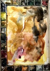
He began by wetting the sky area, brushing on some blue and yellow glazes and progressing by building up layers. “Whilst it is wet you can do anything with it. Once dry you can do nothing.”
It was surprising that, bearing in mind it was to be a snowy picture, he pretty much covered the whole paper in colour. He continued building up the painting, sometimes using his fingers and not always being particularly gentle with his brushes, commenting, “It looks rubbish at the moment.” “It does get odd at times.” He added darker tones to the trees and river as the painting moved along and cadmium orange into the reeds.
As he approached the final stages he talked about putting in the detail when you need to be a tad more careful with your brush marks. “Paint above your brush, turning your paper if needs be”, was his advice.
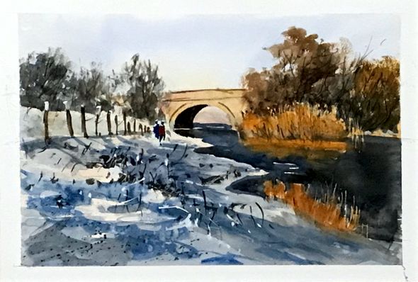
Finally he added some white gouache for highlighting the snow and mixed a little with some cadmium orange to put some detail into the reeds. The last and my favourite quote - “The success of the white is in its frugality.”
In less than two hours David had produced a wonderful painting. We all learned a great deal and his relaxed, chatty and friendly demeanour made the occasion all the more enjoyable for us.
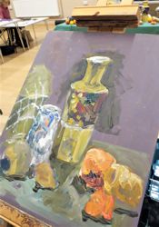
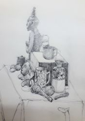
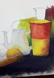
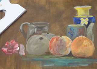
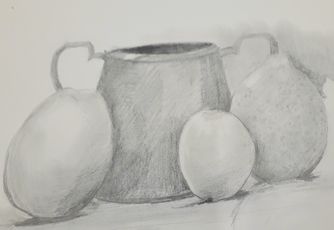
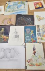
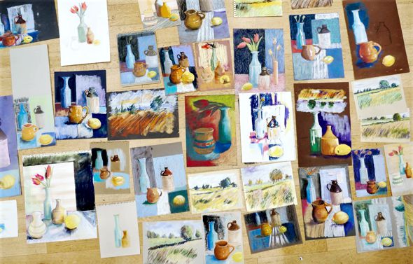
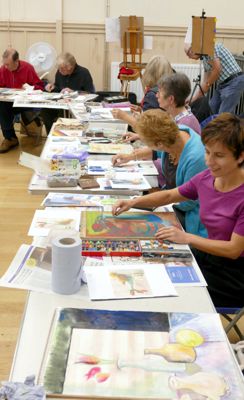
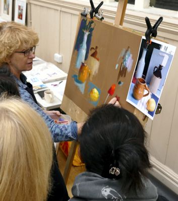
Still Life Workshop inspired by Old Masters
With artist and author Susie Hodge - 25th February 2020
Susie Hodge MA FRSA is a UK author who has written over 100 books on art, art history, history and artistic techniques. Susie's other activities include lectures, talks and practical workshops, plus television and radio talks and documentaries about art. We were delighted to welcome her for this Workshop.
The theme for this evening was Still Life painting inspired by Old Masters and Susie illustrated her introduction with a series of paintings from the earliest still life images produced by Caravaggio in the 16th Century up to the early 20th Century - Cezanne and Van Gogh among others.
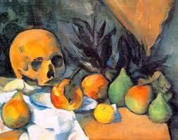
Paul Cezanne - Still Life with Skull
Still Life paintings were considered a minor art form and Caravaggio’s Basket of Fruit 1599 was a departure from his dramatic and theatrical style but demonstrated his revolutionary chiaroscuro technique of the use of light and shadow to create the illusion of light with intense darks and strong bright colours. His depiction was very honest with spoiled fruit and broken leaves. This painting has a light background which was very unusual at this time. Susie showed a range of early Spanish and Dutch paintings with extremely dark backgrounds and detail which was almost photographic. The English term Still Life derives from the Dutch word stilleven.
The treatment of Still Life painting changed in the 19th Century with work by Manet, Monet, Matisse and others showing much softer forms, discernible brushwork, playful perspective and this development continued with Cezanne, Van Gogh, Braque and Picasso taking even greater risks. Many of these artists used dark outlines to the forms, used different viewpoints and vibrant colours to express themselves through the work.
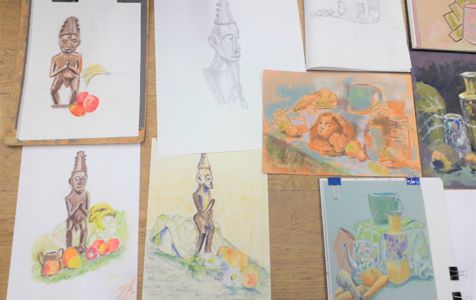
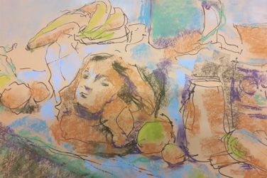
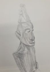
After this whistle-stop tour Members began to draw or paint the objects which Susie had set up for the evening. There was an eclectic display of fruit, vegetables and pots together with a terracotta female head and an African wooden figure set up on checked cloths - a challenging prospect. Paper, board, pencils, pens, paints and pastels all came into play as Members created images, perhaps with some of the illustrations in mind with regard to colours schemes, viewpoints etc. The resulting images ranged from bold paintings to well observed tonal drawings.
During her presentation Susie shared her extensive knowledge of the artists whose work she had chosen. Few had the notoriety of Caravaggio but all had an impact on the popularity of and regard for Still Life as a serious genre in art. This was a very stimulating and interesting evening and Susie was warmly thanked for encouraging us to look back at the Old Masters for inspiration and for her hints and tips as she spent time with each Member during the Workshop.
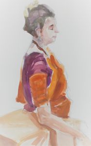
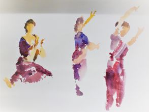
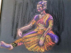
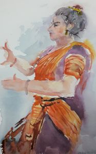
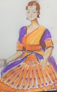
Indian Classical Dancing
Workshop - Demonstration by Fabrizia Verrecchia - 18th February 2020
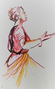
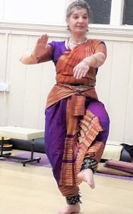
Fabrizia Verrecchia’s love for dance began as a child attending Bharatanatyam classes at a Krishnamurti School in Southern India. Returning to England she continued her training and now teaches and performs this traditional dance form which originated in the Temples of Tamil Nadu over 2000 years ago, and alternates between:
- pure dance - rhythmical footwork, intricate hand gestures, shaping the body into a symmetry of triangular lines and spaces, and
- expressive dance - each hand gesture is given a meaning and facial expression portrays the lives and legends of Hindu deities.
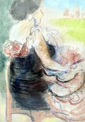
35 Members attended this workshop and were fascinated as Fabrizia gave an outline of the origins of this dance form and demonstrated the graceful, meaningful hand gestures. This was followed by a short performance which some members sketched and others simply enjoyed. Dressed in a beautiful costume of shimmering oranges and purple, with anklets of tinkling bells, Fabrizia danced to traditional music. It was entrancing.
“Dance is a way of creating an awareness and confidence within oneself.
This sensing of toe to fingertip shapes the body into moving sculpture.”
An experienced dancer and teacher (of yoga and meditation also), this was the first time Fabrizia had modelled for an art group and following the demonstration she executed some repetitive dance movements and some (very) short standing poses. This was followed by longer seated poses with the second half of the evening devoted to a long relaxed pose.
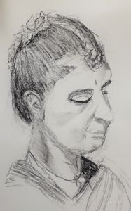
Fabrizia was warmly thanked for introducing this South Indian Dance form so eloquently, for her superb performance and for her serenity in posing for us. Members enjoyed the opportunity to draw, sketch and paint such a colourful model. The traditional music was relaxing and the variety of work produced was exciting and vibrant. This was a very special evening.
Seeing things differently
Workshop with Marianne Dorn - 28th January 2020
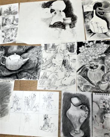
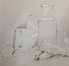
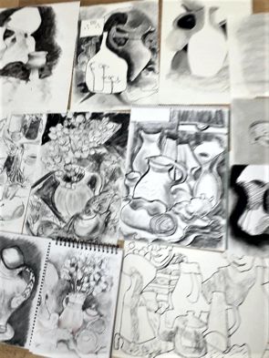
Participants were intrigued by the interesting list of materials required for this multi-station Workshop which was run by Member, Marianne Dorn. Three areas were set up, one with animal skulls, bones and animal figures (from Marianne’s collection) and two with still life objects on fabric which had been chosen for their interesting shapes and forms. Marianne described the approach to each of these drawing tasks and, split into three groups.
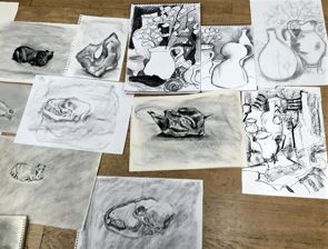
Members spent approximately 30 minutes on each. Fortunately, Marianne had provided notes on each and these are shown below together with images of some of the sketches and drawings which resulted from this very stimulating exercise. (Members who were unable to attend will be able to try out these drawing exercises from the notes.)
Negative Shapes - Materials - A3 to A4 size paper - A black pen or felt-tip taped to a long stick - A broad stick of charcoal OR pastel OR graphite OR ink
Focus on one item from within the still life. This will be your main subject (eg one jug). But rather than drawing this item itself, you’ll create an image by drawing or painting the space around it.
First 5 minutes. Use masking tape to attach your pen to a stick. Very loosely draw out the structure of your picture.
Next 10 mins. Use broad sticks of charcoal or pastel OR washes of ink to block in the spaces around the main subject. Remember that these spaces include those to either side of, above and below but also behind and in front of your chosen item.
Final 10-15 mins. Work back over the image to create a more coherent picture. Use either lines or further layers of tone. You might want to leave your chosen item as untouched paper, or you might prefer to work over it or perhaps to use line or tone to suggest a space in front of it.
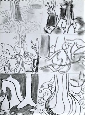
One still life, six ideas - Materials - A3 to A4 size paper - A ruler - A tonal medium in which you’re happy to draw quickly, e.g. pen, pencil, charcoal or graphite
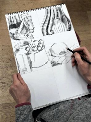
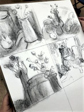
First step: Divide your piece of paper into six equal small rectangular blocks using one horizontal and two vertical lines.
Over the next 25 minutes: Make six very quick sketches from the still life. You’ll have to work fast: it’s just about enough time to suggest the structure of each image. You have only about 4 minutes per drawing! You can “zoom” in or out to include as much or as little of the composition as you like with each drawing. Consider getting down on the floor or stepping well back to create a new viewpoint. Take care not to repeat the same image twice. The aim is to end up with six very different compositions. Be imaginative. Swap places with one another as needed so that you can see the still life from different viewpoints.
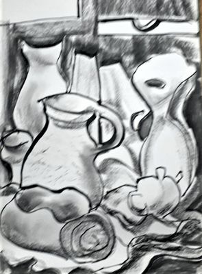
Marks and tone - Materials - A3 to A4 size paper - Charcoal or graphite - Eraser or putty rubber - Piece of kitchen paper for smudging and blending
First, quickly cover a sheet of paper with soft charcoal or graphite using the side of the stick. If needed, smudge with a piece of kitchen paper to make a fairly even tone. Choose one still life item to draw.
The next 5 mins is spent making 300 short rapid marks on the page using the point of a charcoal or graphite stick. Count them as you go. The marks should represent the general structure of your subject. Keep looking at the still life during the whole process.
The next 20-25 mins. Look at your page. Think of it as a piece of clay to be modelled and carved into. Spend this time in redrawing some areas, erasing others and using the side of the charcoal or graphite to create regions of tone. Don’t aim for realism.
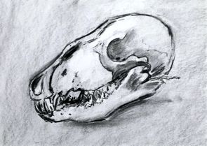
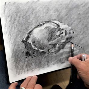
The evening ended with a discussion of these three approaches. The work produced was lively and exciting. Everyone agreed that the swift, free approach to the still life exercises was very invigorating. The fine tonal drawing of the exquisite skulls and bones was a complete contrast and a reminder of how much we all love to draw. Marianne was warmly thanked for organising such a thought-provoking Workshop and for her advice and encouragement throughout the evening.
Painting in Gouache - Demonstration by Paul Fennell
10th December 2019
Paul Fennell is a professional artist who teaches Watercolour, Gouache and Oil Painting, Mixed Media and Drawing Media, mainly adults and currently at Courtyard Arts among other venues. His influences include The Renaissance, Pre-Raphaelites, Abstract Expressionism, a rather intriguing mix.
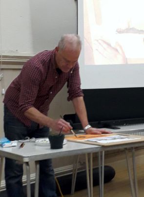
Gouache is a little known medium, sometimes referred to as “Body Colour” and although a full range of colours is available as Gouache Paints, Paul achieves the same result by using an artists’ quality Titanium White mixed with watercolour paints (in tubes) in his chosen colours. (He advises not to use Zinc White as this has poor coverage.) Rather than working light to dark, as in watercolours, gouache can be used rather like oils and acrylics, from darks to lights as it is an opaque medium.
Paul advises using a tinted ground, either with a watercolour or acrylic wash and ensuring that the paper or card is not too porous. Mount board is a suitable base. A thin layer of gesso can be used to prime the surface and he favours working on a coloured ground as small gaps in the paint layer tend to harmonise the painting.
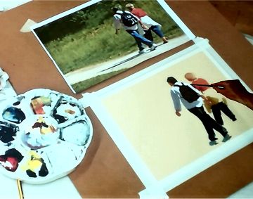
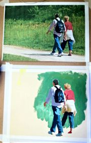
For his first demonstration he used Lemon Yellow, French Vermillion and Prussian Blue on a watercolour palette. Ordinary watercolour brushes in various sizes and shapes are fine - sable or synthetic. He sketches two figures from a photograph. This is a back view of walking figures with strong tonal contrasts. He begins by blocking in the shadow area of the man’s shirt and then a strong dark blue for the shadow side of the trousers - almost pure watercolour, but a strong mix. He prefers to do the figures or the main elements of a painting first and then the background, on the principle that small corrections can be made in this opaque medium when adding the background. He continues to block in the figures, mixing strong colours and laying the paint on boldly. Highlights will be executed later, using the white gouache to achieve tints.
Paint which is too thick (or not quite right) can be rewetted and blotted off. Corrections can be done throughout. Paul points out that darker colours dry lighter and lighter colours dry darker. This is a quality of the paint and, with practice, can be allowed for.
Paul gives us a little background. Body colour had been used throughout the ages. Turner used body colour as did watercolourists who needed to add light tints in the final stages of their paintings. Gouache was very popular in the age of railway posters as the bold blocks of colour were very suitable for printing eye-catching advertising images. Graphic designer favour the matt finish of these paints. They are very similar to the powdered paints used in schools. Being water soluble, they are rather vulnerable prior to framing.
Paul describes his manner of painting in this medium as “looking for the shapes and keeping them crisp and distinct, rather like pieces of a jigsaw puzzle”. Some mixing can occur, say with a light colour over dark, and this can be used deliberately to soften the contrast. (Remarking on the choice of Prussian Blue, Paul feels it makes good greens and is richer than other blues in the watercolour ranges. However, he doesn’t rate it as highly as an oil colour.)
Having completed the figures with various paler areas of paint, Paul mixes up paint for the background. He achieves a mixture which he describes as rather like emulsion paint and swiftly, using a largish brush, blocks in the green surrounding the figures.
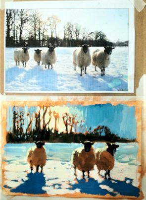
For his second demonstration, Paul has prepared an orange ground and has a photograph of sheep on a snowy field with a strong backlight. He initially sketches the sheep in a dark brown wash and places the background hedgerow and trees in the same tone. This was allowed to dry. Strong blue (Ulramarine or Cobalt this time) shadows cast by the sheep were added followed by various delightful shades of pale blue in the snow and sky and yellow beyond the trees in the sky, perhaps cast by a setting sun. Painting around the branches of the trees was rather tricky. The sheep were defined by some subtle warm colours and brilliant white highlights. A few white touches on the snow completed this lovely, atmospheric piece and the warm orange background colour really did bring it together.
Paul was warmly thanked for demonstrating two quite different approaches to painting in gouache. It is a medium which brings echoes of using poster paint at school but Paul’s vibrant and fresh presentation will definitely encourage Members to give it a try. The images create by Paul in such a short time were crisp and colourful and since we only need one tube of white gouache paint to enhance our kit, this is an exciting (and inexpensive) technique to explore.
Mixed Media Workshop with artist Vanda Campbell
19nd November 2019
Before we actually got to the Art Workshop we were given a list of things that would be required for that evening: - Sketchbook with good quality paper - Watercolour paper - Watercolour paints - brushes several different sizes - palette or plate for mixing - water pot - kitchen roll and masking tape - water soluble pencils - two square pieces of sand paper - felt tip pens - normal pens - wax crayons - oil pastels - pencils - rubber - ruler - sharpener - water spritzer bottle - photographs of landscapes or views of choice plus small objects we might like to paint.
This made me wonder what we were going to achieve from such a variety of things to bring. Surprisingly, we used most or all of the above and to amazing results under the guidance and watchful eye of our guest artist teacher Vanda Campbell. Vanda is a Fine Art graduate with an MA in Applied Art and she loves to work in mixed media in a free style which was the main focus of the workshop.
We started with a swift pencil drawing of a silk flower on sketchbook paper - without lifting the pencil from the paper. Vanda had brought these flowers along to aid in “loosening-up” exercises. She described these sketches as “flat and one-dimensional”. We then had to repeat the process, changing medium to perhaps watercolour pencil or crayon and then continue with pen or charcoal and keep switching mediums till there was a whole variety on the page. A quick splash with the water spritzer over all this gave us a lucid colour spreading before our eyes making patterns and designs quite unique.
Repeating this process on better quality paper (and using a photograph for reference) we were encouraged to keep lightening the process with the spritzer which made the outlines blurred at first. By using different media the image could begin to take shape with softened lines and bolder areas worked on as the painting progressed.
Vanda gave tips and advice throughout and gradually some amazing results were accomplished with care and thought plus a final sprinkle by scratching watercolour pencil over sandpaper, creating dots and dashes on the page. Sandpaper can also be used to score fine texture onto areas of paint. It was interesting to see how different materials responded to the water spray technique.
I feel we all learnt something about the great variety of ways our materials can be used to create a mixed media painting. Everyone enjoyed looking at the colourful and varied works produced in such a short time. Vanda was warmly thanked for introducing us to this exciting way of working with traditional materials. This will certainly give us something new to try in the future.
Painting the Mayor’s Portrait
22nd October 2019
The longstanding tradition of Hertford Art Society painting the portrait of the Mayor of Hertford was upheld on Tuesday evening with current Mayor, Rosemary Bolton agreeing to sit for the Society.
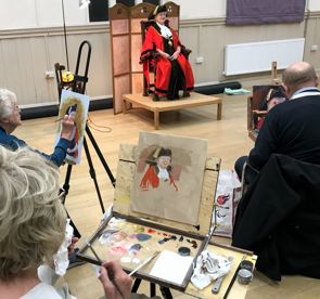

The session was well attended with many members, obviously well versed in the demands of painting the portrait of such an important local dignitary, quickly settling down to work. I for one, as a novice portrait painter, found the task somewhat unnerving and I wondered how it felt to be the person forced to sit still for two hours whilst a group of artists worked away creating their masterpieces.
The answer came in the following response I received from Mayor Rosemary Bolton having posed exactly that question to her.
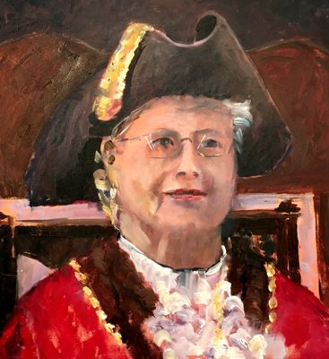
Mayor's Portrait by Stephen Lowe
“Although I knew it was a tradition for the Mayor of Hertford to have their portrait painted by the Hertford Art Society, I was honoured and quite apprehensive to be invited to join them on a dark and damp evening in October. I had had a very busy day and was a little late and felt more than a little awkward. I don't like having my photo taken, the thought of being immortalised in paint was daunting.
However, I had nothing to worry about. The lovely Linda Radford (a former Mayor of Hertford and also a former Chairman of the Art Society) was there to help me, and everyone made me feel welcome.
It is an odd sensation sitting on a grand chair on a platform, dressed in full robes and chains, and having to sit still without moving or talking for 2 hours is an alien concept for me (I should apologise to anyone who has ever sat behind me in a concert or play!).
The Hertford Art Society artists are very talented, and I was in awe of their skills as I looked at how the works were progressing in the break. All the paintings and drawings were very different from each other, and it is interesting how perception differs between the different artists. I am looking forward to seeing the final results in due course.
best wishes,
Rosemary Bolton”
Having viewed some of the artwork produced on the evening, I’m certain Rosemary will not be disappointed.
Chris King
The Joy of the Unexpected
Printmaking workshop with Jude O’Sullivan
15th October 2019
Jude O’Sullivan’s knowledge of printmaking is extensive. Her background is in design and she began her career in advertising and as a freelance graphic designer. She has 25 years plus experience in teaching and was formerly Head of Art at Oaklands, St. Albans. Luckily for us she moved to Hertford and is still teaching classes and workshops.
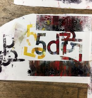
Jude brought some wonderful examples of her work for us to see.
They showed different printing processes including screen printing, linocuts and collographs. This particular evening was all about monoprinting and Jude brought all the equipment we were going to need including a box of antique letterpress letters and numbers which she used for her first demonstration. Her preferred inks are oil based - rich, professional finish but longer drying time and messier to clean up than water-based inks. Jude used three primary colours and with a palette knife she mixed an orange shade, inked up a roller and applied the ink to a small group of printing blocks. She then took a print by running a heavy roller over fairly thin paper laid on top of the blocks. The image was then overprinted onto the same sheet by re-inking and repositioning the sheet to create interesting, overlapping shapes (and colours).
Jude had also brought a variety of leaves and a car gasket - anything goes, it would seem. Ink was applied to the leaves which were laid on a panel of colour directly rolled onto a sheet of thick aluminium (glass would be fine) to give a two colour image. When the leaf was removed and a further print was taken there was a lovely image of the veins of the leaf impressed in the original inked panel.
Having been shown the techniques, a very playful (and very messy) time was had by all the Members who attended. Leaves, seedheads or anything really can by laid onto an inked panel to create a “negative” image on the original print before repositioning items for a further print. An image can be created for monoprinting by drawing or scratching directly into the inked panel before taking a print or two or a sheet of paper can be laid gently on to an inked panel and lightly drawn over to get an inked image. Always remembering that the image will be reversed when printed.
Our finished results were assorted and intriguing. We were happily commended by Jude and she was thrilled with our efforts.
We were all able to take out masterpieces home (sandwiched between newspaper as they were quite wet). Some will make great greetings cards, collage materials or serve as ideas for further artworks. Jude was warmly thanked for sharing her expertise and experience in this workshop which was thoroughly enjoyed by all.
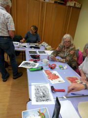
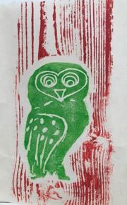
Print Workshop at Hertford Museum
25th September 2019
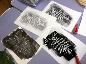
Hertford Museum sponsor practical arts workshops for the general public and these are tutored by Hertford Art Society Members in their well-appointed studio at 18 Bull Plain, Hertford SG14 1DT. September was print time and the workshop was run by artist Geoff Bennett. Attendees got a brief introduction to the prints held by the museum and were then invited to look at the displayed exhibits for likely subjects to print. They were shown how to draw their chosen subjects onto polystyrene sheets, creating indentations similar to gouges in a woodcut or linocut. They rolled printing ink onto the polystyrene images, to produce a print plate able to create good looking prints.
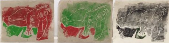
Here are some of the results (the lady with not many clothes on was not a museum exhibit lurking in a glass case; she is from a drawing made at a HAS Saturday workshop & brought along by a HAS member who joined the printing class).
There is always something interesting going on at the Hertford Museum for visitors of all ages and it is hoped that further art workshops will be run in the future. Check the Museum website www.hertfordmuseum.org for details of their activities.
Pastel Demonstration and Workshop with Artist, Jan Munro
17th September 2019
Jan Munro is a Member of the Pastel Society, has won many awards for her contemporary paintings and has recently exhibited at the Mall Galleries. She paints in pastels, watercolour and acrylics and runs workshops and classes.
Jan brought examples of her vibrant work, sketch books, irresistible cards and an array of pastels to make your mouth water.
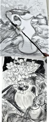
The evening began with a quick and lively still life demonstration on Sennelier pastel card. This 400gsm ph neutral board has a slightly abrasive fine tooth surface. Jan much prefers this to regular pastel paper.
Jan had lightly sketched a still life arrangement and begins with the objects, starting with the lightest tones of a vase and using the side of a piece of broken pastel. She applies the pastel firmly and the surface of the card “grabs” the colour, giving a dense, bold start to the image. She moves on to mid and darker tones for the vase before applying a dark background which makes the object jump forward. Composition and design are key elements of her paintings to achieve a feeling of balance with a sense of light and space.
Inspired by her skill and enthusiasm we followed her lead to produce an array of intriguing still lifes of our own, using photographs which she provided.
She also uses Uart paper which has the advantage of being able to take water. Some of us progressed to doing a landscape for which she gave us another short demo. This was very much less is more and immediately convincing.
Jan’s pastel technique was bold and vibrant. Her paintings have great energy with a strong focus on design. She gave us lots of practical tips, individual instruction and encouragement and the display of work at the end of the evening illustrated how much we had learned. This was a productive an enjoyable evening which was very well attended by members and Jan was thanked for sharing her skills and enthusiasm with our Members.
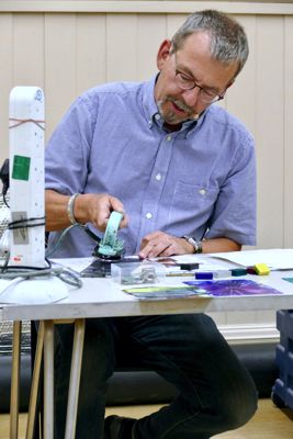
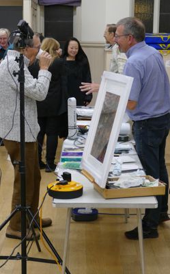
Encaustic Art - Demonstration by Phil Madley
10th September 2019
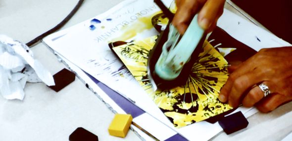
Phil Madley is an experienced graphic artist and photographer and has developed his own style of working with encaustic wax. Encaustic painting, also known as hot wax painting, involves using heated beeswax to which colored pigments are added. The liquid or paste is then applied to a surface using a small iron or other heated tools. He brought along various examples together with the kit needed to demonstrate this unique medium.
 Phil explained that the ancient Egyptians had used beeswax and minerals with hot tools to decorate objects and tombs.
The paintings are done on glossy card and Phil had a range of coloured wax blocks together with a small iron which can be set to various levels depending on the colour chosen. Lighter colours have a lower melting point. He also had a hot stylus which comes with a variety of shaped tips and a paint stripper to get a blown effect on the melted wax.
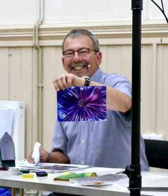
He set the card on a scrap magazine (soiled pages can be discarded) and spread some coloured wax onto the surface of the hot iron. This he quickly “ironed” onto the paper, manipulating the iron to achieve thick and thin areas of wax. Using a single colour for this example, he applied different parts of the iron to the paper, with varying degrees of pressure to make an interesting and varied design. This is an exciting process as abstract elements appear. He wiped off the surplus wax from the iron with paper towel and began another work in pinks and purples. Using just the edge of the iron he created a starburst image rather like a flower. The point of the iron made highlights in the centre as did a small brass tool used for scratching off areas. The two colours blended in a very subtle manner. Phil created a range of small images in various colours to demonstrate the very large variety of effects that can be achieved with imagination and deft use of the iron.
Using just the tip of the iron and rotating the card can produce interesting circular shapes. Transparent wax can be used as an undercoat to enable further coats to “float” on top. As well as white glossy card, the wax can be applied to gold or silver card. Phil has worked in this medium on large sheets of prepared MDF board with great results. In his studio he often works on an A2 hotplate with card set on top. When the small paintings were dry, Phil polished the surface with paper towel to bring up a high gloss finish. He then demonstrated a very exciting seascape using dark blue wax on silver card. The tools make a huge variety of marks, some very delicate and fine and this medium can be used successfully for landscapes.
Phil’s final piece was rather dramatic. The iron was set to a high temperature and the wax block allowed to melt and run down onto the paper. Several colours were used then the surface was blown with the paint stripper causing the colours to blend and flow. Silver was then applied to some areas. The outcome was very abstract and subtle.
Encaustic wax is certainly a very colourful and dramatic means of making images. Phil was thanked for providing a very different and exciting demonstration and for sharing his insights into this unusual art form.
Collage Workshop at Hertford Museum
19th June 2019
Artists from Hertford Art Society have run a number of workshops at Hertford Museum in their well-appointed studio at 18 Bull Plain, Hertford SG14 1DT. The latest was a Collage workshop - with a still life set up using items from their varied collection of artefacts as a source of inspiration.
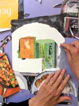
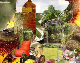
The early years of the 20th century saw Collage truly emerge as a medium in its own right with the Cubist experiments of Pablo Picasso and Georges Braque who coined the term Collage (from the French: coller, "to glue). Sara Taylor, Museum Curator, presented some well-known images from these early 20th Century artists and others, such as David Hockney and Robert Rauchenburg, who use collage in their work.
Participants then developed a sketch using elements of the still life set up with emphasis on bold forms and interesting contrasts and transferred their design to thick paper. Artist Kathy Burman gave guidance on design, materials and techniques. Magazines and newspapers provide a huge range colourful and stimulating images and additional papers can be created using acrylic paint. Papers can be torn or cut to shape, layered and glued using PVA or wallpaper paste.
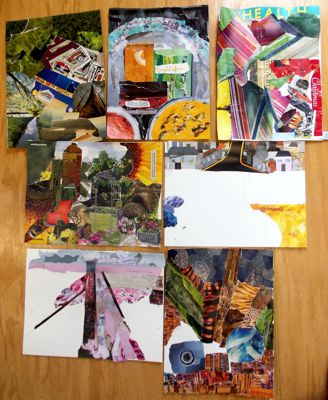
Choices were made and, gradually, interesting images began to take shape. On this occasion the participants worked primarily from their imagination, some in an abstract manner. The final pieces were very exciting and, although collage was a new medium, all found it absorbing. The session ended with a review of everyone’s work and it was fascinating to see such a wide variety of styles and images emerge from this Workshop.
A Print Workshop is planned for Wednesday 25th September 2019, 10am - 12.30pm. There is always something interesting going on at the Hertford Museum for visitors of all ages. Check the Museum website www.hertfordmuseum.org for details.
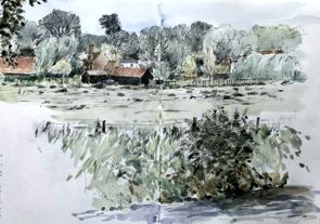
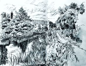
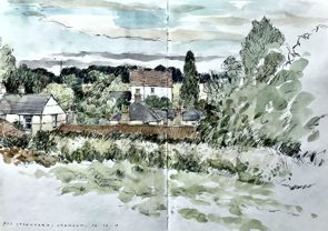
Summer Sketching Evenings 2019
The 2019 Summer Evening Open-Air Sketching Programme opened on 21st May with a visit to an indoor venue. Hertford Art Society Members were invited once again to sketch at one of the Hertford Choral Society’s rehearsal evenings. This was an evening full of music and movement and was greatly enjoyed.
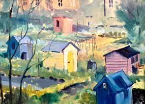
The following week saw us enjoying the bright evening sunshine on Hartham Common and the Folly Allotments. This particular evening turned out to be probably the best evening weather of the Programme.
Painting the villages of Bayford and Brickendon on 4th May was disappointingly cloudy, and the following week was no better at Sawbridgeworth Maltings with only 4 Members attending. However, the painting weekend at Aldeburgh on 7th to 9th June was enjoyed by about 19 Members.
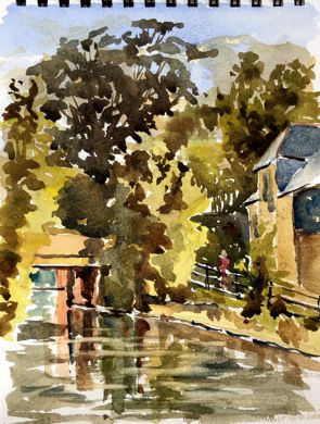
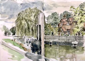
Rainy weather on the two following Tuesday evenings was disappointing. July improved with a sunny evening at Standon and a well-attended evening at Hertford Lock, despite a dull evening.
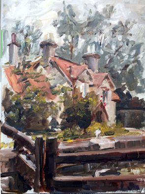
Stanstead Abbots on the 16th July was more as a summer evening should be. After another sunny evening at Westmill Village it was back to a dull, cold evening at Stanborough Lakes on the 30th. On 6th August a handful of members painted Ware Town and the Programme concluded with a very enjoyable meal out for the hardy artists.
 Advance Notice
During our Summer Sketching Programme next year, the Quakers are very keen to have us paint/sketch in the Friends Meeting House in Hertford as part of the celebrations to commemorate the construction of the building 350 years ago. One session would be on a Thursday evening and one all-day Saturday. Dates to be advised.
Summer Painting Weekend - Aldeburgh, Suffolk
June 7th, 8th and 9th 2019
In terms of numbers attending (17) the Aldeburgh trip was the best so far and I’m sure those who made it for the first time will join us again next year.
John Jarratt
On Friday it pretty much rained all day forcing most of us to sketch from our cars. Ever the brave souls, HAS members took it as an opportunity to get into the painting zone knowing that our reward would be “Fish & Chips” from the best chip shop in England. This certainly proved to be the case followed by a sociable evening in the put next door.
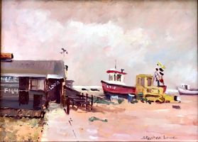
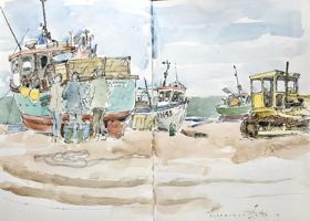
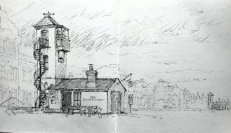
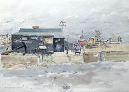
Stephen Lowe, Left: Aldeburgh estuary - Oil; Right: Aldeburgh Fish Hut - Oil
On Saturday, just as our enthusiasm began to be tested by the wind and rain, out came the sun followed quickly by the paints and for me two quick oil sketches went down - satisfaction at last!
That evening we all met up at the “Lighthouse Restaurant” where we had another delightful meal thus confirming the rumours that in reality we were just a bunch of gastronomes.
John Jarratt
On Sunday, under bright blue skies and a passive breeze, we made our choices of location, some on the beach and others, like myself, went to Snape where I tackled a large canvas which I hope one day to finish - where have I heard that before?
So what of next year? One suggestion has been put forward - Winchester - but we have not finalised our choice yet, however maybe Members could pencil in the first weekend of June 2020.
Happy painting friends.
Stephen Lowe
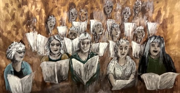
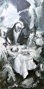
Painting and drawing the Hertford Choral Society
21st May 2019
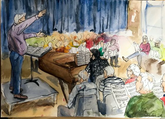
The first session of the Summer Programme was held at Sele School in Hertford where the Hertford Choral Society were in rehearsal for their Summer Concert. A hundred singers arranged three sides of a square in front of a pianist plying his trade on a grand piano, and of course the conductor, Derek Harrison. So plenty of perspective challenges to go along with that of capturing on paper a mass of people standing up, sitting down, leafing through scores and generally shifting around on their hard school chairs. It’s Gareth Malone meets The Painting Challenge.
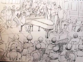
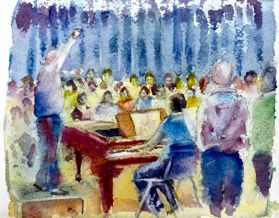
The big decision was whether to focus on a small group of singers or to go for the whole story, get everything in. And whether to spend the evening drawing or to break out the paints and get some colour into the scene. We also had the option of working close to the singers, or taking a longer view from the stage or a balcony.
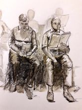
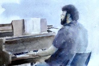
So plenty of choice, and plenty of solutions as evidenced by the variety of images collected in the following days. Thank you Artists who sent in their pictures and thank you Hertford Choral Society for letting us draw and paint you as you filled the Hall with your splendid music. A great start to our Summer Programme.
2019-2020 Critique Winners
Critique winners of the 2019 – 2020 season as chosen by Members
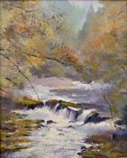 David Stowe April 2019 Winner Yorkshire Bridge, Derbyshire - Acrylic |
 Jill Rolfe April 2019 Runner Up Hellebore - Mixed Media |
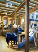 Joe Rowson September 2019 Winner Bebo Cafe - Oil |
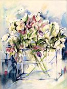
 Lynne Lawrence September 2019 Joint Runner Up Lilies - Water Colour |
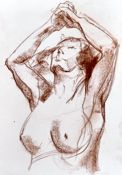 Marianne Dorn September 2019 Joint Runner Up Nude Study - Sanguine |
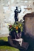 Craig Lee September 2019 Joint Runner Up Planter Angelesy Abbey - Oil |
 Brenda Thompson October 2019 Joint Winner My Red Comforter - Acrylic |
 Marianne Dorn October 2019 Joint Winner Flamenco - MM |
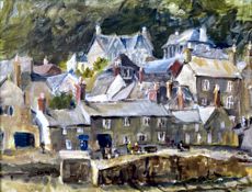 Ray Ward October 2019 Joint Winner Mousehole -Acrylic |
 Jill Rolfe November Critique Winner Musical Interlude - Mixed Media |
Ray Ward |
Janet Dobney |
Archive PROGRAMMES
Winter 2019-2020 programme
Summer 2019 programme
Winners of Critique Sessions 2019-2020 season
David Stowe,
April 2019
Winner
Yorkshire Bridge, Derbyshire - Acrylic.
Jill Rolfe,
April 2019
Runner Up, Hellebore - Mixed Media.
Joe Rowson,
September 2019
Winner,
Bebo Cafe - Oil.
Lynne Lawrence,
September 2019
Joint Runner Up,
Lilies - Water Colour.
Marianne Dorn,
September 2019
Joint Runner Up,
Nude Study - Sanguine.
Craig Lee,
September 2019
Joint Runner Up,
Planter Angelesy Abbey - Oil.
Brenda Thompson,
October 2019 Joint Winner,
My Red Comforter - Acrylic.
Marianne Dorn,
October 2019 Joint Winner,
Flamenco - MM.
Ray Ward, October 2019 Joint Winner, Mousehole -Acrylic.
Jill Rolfe,
November Critique Winner,
Musical Interlude - Mixed Media.
Ray Ward, January 2020 Critique Winner, Looking Down - Acrylics.
Janet Dobney, February 2020 Critique Winner, St Matthew Passion - Acrylic.