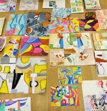
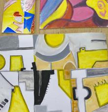
Summer Programme 2016 - Gallery of Work
|
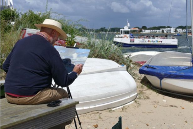
John Jarratt
Goldings “The light was good although failing and for about the first time I managed to capture a landscape in a manner that satisfied me considering the short time we had.”
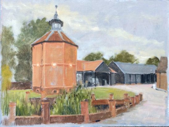
Manor Farm at Walkern “I have painted this place before and found it a little easier this time as I cut out a lot of fiddly bits to get the basic units portrayed.”
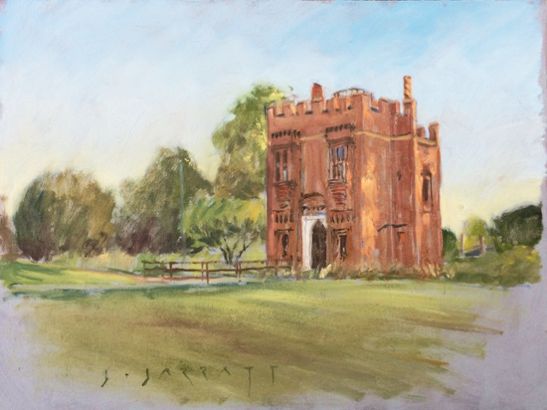
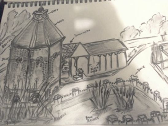
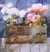
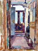
Rye House Mansion Gatehouse “I have never heard of this place so it was a pleasure to come across it. The weather was the best we have had and by painting furiously I just managed to get the feel that I wanted in the hour and a bit we had.”
Craig Lee
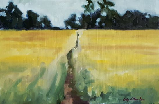
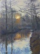
Walkern field study “On arrival at the Walkern Ford it was pointed out to me by a fellow member that there were some nice surrounding fields worth a look. A short walk later I came across this lovely view which suited me down to the ground, as I only had around 90mins of good light left. I was happy with the end result and felt I managed to captured a feel for a summers evening. Painted in Oil on a 10 x 8 panel.”
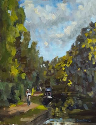
Ware, River Lea “I had decided to go larger than I would usually paint Pleinair and used an 11 x 14 panel. Needing the extra time, I decided to turn up an hour earlier than the suggested 19:00 so I could make the most of any reflections upon the water because it was such a sunny evening. As it happens the view that caught my eye was this one along the shaded part of the river, where the sun was just peeking through the tree tops to the right just highlighting the side of a barge giving some interest. The cyclist that I feel helps depict the painting as the river Lea was added at a later date from a photo taken on location. Okay, so it's probably not my greatest achievement to date, but I like it. It's a large spontaneous and loose Pleinair oil painting which I managed to put some expression into. (Great fun!)”
Persis Limbuwala
“The image is of a private home along the High Street in the village of Walkern - that was originally a Dovecote and the owners have sympathetically turned it into a family home. It is a basic pencil and charcoal sketch. I have made notes on the sketch to recall the colours in order to make a painting out of this sketch at a later time.”
Ray Ward
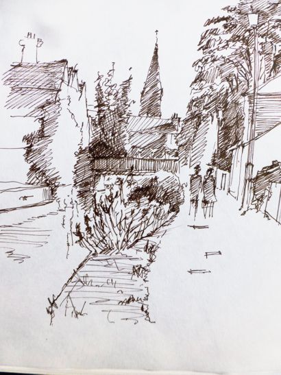
Hertford “ Last evening of the summer, decided a pencil sketch due to limited time as we were all meeting up for the end of summer meal.”
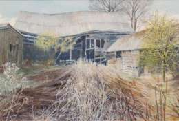
Walkern “Chose a sketch format of interesting barns as it was a low cloud evening.”
Broxbourne “Searched for a time to find something to catch my imagination, this limited time, decided to do a pencil sketch.”
Margo Ward
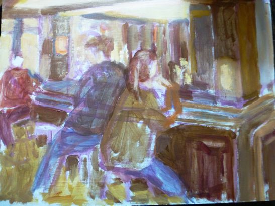
Inside the Barge Pub, Folly Island “Nasty wet evening. Phoned earlier to get permission to paint inside the pub. Managed an acrylic sketch but found the low light difficult to finish the painting.”
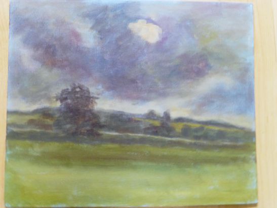
Datchworth “The sky was interesting, made an attempt to capture the stormy feeling. Acrylic is my main medium at the moment.”
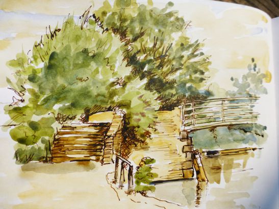
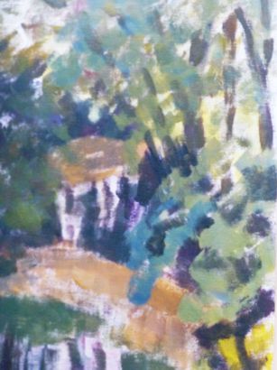
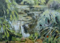
Walkern “Sighted myself on the bridge over the ford. Tried to paint the light reflection in the water, almost an abstract but like the colours. Certainly a subject I need to practice.”
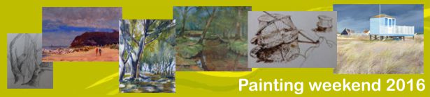
Painting Weekend at Christchurch and Mudeford, Hampshire 1st - 3rd July 2016
The wind and rain became our companions over the weekend but that only spurred us on to greater things mainly in the wet into wet style!
Most of the party of eight arrived at Christchurch on Friday 1st July after a painting stop-off at Bolder in the New Forest. Some of the better results came from this stop-off as it was more out of the wind. That evening the group dined out bohemian style at Pinocchio’s Pizza restaurant an eatery full of Italian character and worth revisiting one day. The serious painting started on Saturday as most of the group took the ferry from Mudeford Quay to Hengistbury Head. In spite of my research the parking authorities still managed to empty our pockets somewhat. I should have suspected this might happen as the area is renowned for pirates! All day Saturday the sun came in and out from behind some heavy clouds which occasional dropped their burden of rain on us but we in turn dodged in and out of the showers through invites from friendly beach hut owners who offered shelter.
The day sped by with so many subjects to choose from, some of the group sketched while others tackled the whole works. Saturday evening saw us all sitting in the Loch and Quay Bistro in Christchurch, listening to the live music and charging our glasses for the Sunday session ahead. All in all a great weekend of painting with something to show at the end, if not masterpieces then bonded friendships.
Painting away for a weekend is an experience very worthwhile having and next year we are planning a trip to Rye and Camber Sands. Please make a note in your diaries for the weekend 14th–16th July which is aimed at post Wimbledon and before the schools break up.
Stephen Lowe
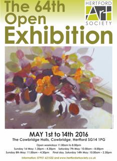
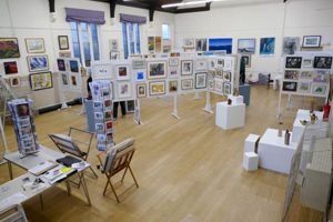
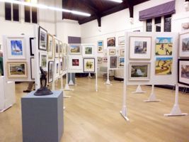
Hertford Art Society 64th Open Exhibition 2016 - May 1st - 14th
Award Winners
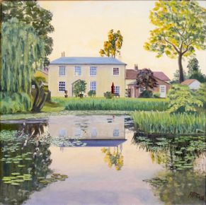
- The John Goss Prize for the painting the judges considered best in show - 'Hydrangea', Stella Green.
- The Lady Laming Award for Abstract Art - 'River Bank', David Quantrill.
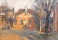
- The Bill Dale Award is chosen from works by Members who regularly support the whole of the Society's activities - 'Old Bluecoats School Hall', Trevor Chamberlain.
- The Mayor's Award for the best 3D work - 'Queue of Life, Bus Stand 7 figures 7 stories', Maria-Luisa Wilkings.
- The Edward Mason Brushes Award for the best watercolour - 'Instant Colour', Anne McCormack RI, SWA.
- Visitors’ Choice Award - ‘Show me the way to go home’, Jill Rolfe.
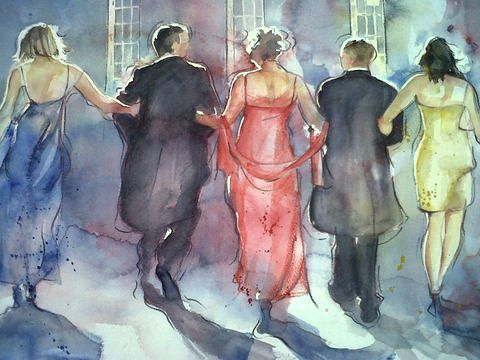
Visitors’ Choice Award
Show me the way to go home by Jill Rolfe - Watercolour
The Exhibition was decidedly Representational this year although there are some abstracts and near abstracts but they are well dotted around.
I love 'kitchen-sink' type art. Top for me was 'Broken Road' by Andrew Naish a close-up of decaying double yellow lines with damaged kerbstones, pitted tarmac, all blues and dull ochres. Yummy! Other delights were John Hardy's steam-engined 'Country Terminus' and the vessel 'P.S.Waverley' by Bill Dean.
I also enjoy striking pictures, ones that are colourful, clever, masterful or even just prettier. My visitor's vote was , 'Down to the Sea, St Ives' by Gillian Flack. Wonderful, gentle colouration in yellows, oranges, palest greens balanced by delicate purple, blue and brown shadows.
Then 'Holkham Beach' by Daniel Hutchings, 'Fish Restaurant' by Roger Dellar, Trevor Chamberlain's 'Old Bluecoat School Hall', a lovely evocation of evening light. The simplicity of fine pen work 'Olive Tree' by Chris Hewitt stood out as restful and delightful. These five high on my Best of Show list.
I find abstracts rather difficult. A couple, very clever in their execution, seemed quite cold to me. More to my taste are semi-abstracts like Terry Bedford's 'The Gate' a Cezanne-ish park scene with a convoluted orange gate to one side. Was it there or not? A semi-abstract sculpture by Heather Jukes called 'Mother and Child', showed a curled female figure with a Henry Moore hole in the centre containing a small child figure with a hole and an even tinier figure within that. Thought provoking. In the 3D works there are a number of ceramic vases and plates beautifully made and finished. 'Purple Vase' a real tour-de-force, brightly coloured in purples, greens and pinks with added flowers, some laid on the surface others sat at the end of deep blue stems, painted leaves and birds. Beautifully made wooden objects, in particular from Dr Waring Robinson whose, 'Flower Stand Mahogany' was the strangest piece of work I have seen for a long time and displaying the highest craft skills.
The Mayor's Award for 3D work went to 'Queue of Life', a bus stand and seven figures. Separate pieces arranged on pavement plus tiny booklets with each story. I couldn't help thinking 'what about the dusting!'
A couple of odd items. Firstly Richard Saunder's 'My Dear Watson'. Surreal in every aspect, a nightmarish, surreal scene with stars, brain coral, bones with blood and stuff, wisps of blue ectoplasm! In the 3D section two tiny little perspex boxes by Diane Loan contained musicians and instruments – 'Fab 4' and a golfer with bag – 'Fore' neatly made from tiny electronic components.
The Open Exhibition was up to the usual high standard and I could happily describe the whole thing but space is short.
The Exhibition results, as always, from the hard work of many members over several preceding days. LOTS of thanks to you all.
T John Jarratt.
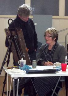
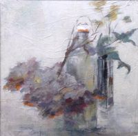
Still Life Workshop Tutored by Paul Curtis NEAC - 9th April 2016
Commuting between London and Sheffield, Paul Curtis delivers workshops and courses on painting and drawing throughout the UK, whilst painting full-time. He is a regular and popular visitor to Hertford Art Society, giving demonstrations and critiques, tutoring workshops and has been a judge for the annual Open Exhibition.
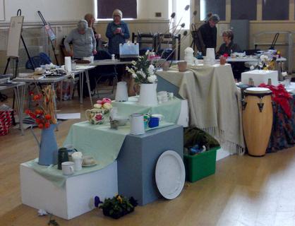
A still life set up was created, spanning the hall and using a variety of levels to create interest. Paul’s treasure trove of objects included jugs, pots, vases - many of which were in shades of white. Flowers and foliage added an extra dimension to the scene.
This was a full day workshop, which gave time to sketch and draw before moving onto a larger work on canvas or paper.
Paul encouraged Members to make a bold sketch or two in charcoal or soft pencil, focusing on areas which caught our imagination. Thumbnail sketches can be most helpful in determining the best composition, sometimes editing out or enlarging an object to give a pleasing arrangement. Moving around the room, Paul gave hints and tips on composition before we embarked on a larger scale impression of our favourite sketch.
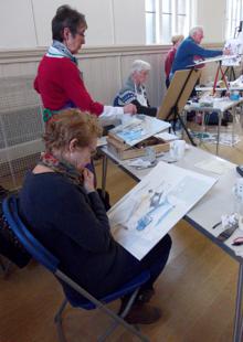
Each artist had brought their favourite materials - some chose to paint in acrylics, oils or watercolours, others worked in pastel or collage. From the initial sketches, participants began to work on the image which had caught their eye.
As the day progressed, we benefitted from expert guidance as Paul spent time with everyone, discussing approaches, colour choices, emphasis on particular areas of the painting while underplaying other parts and many other tips. He advised us to step back from time to time to review the work. Paul is a strong believer in working on several versions of the same picture at the same time. He feels that this allows for development and stops you from overworking the painting, keeping the images fresh and giving room for some surprises as ideas spring up.
Some of the work was completed by the end of the session, others will be worked on later from photographs or the original sketches.
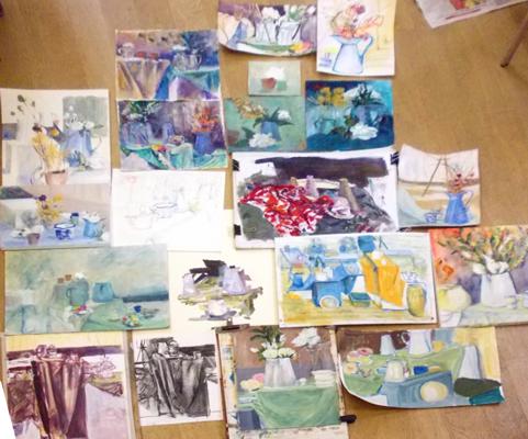
The photo collage of the resultant work really shows what an extremely productive and enjoyable workshop this was. The paintings are full of life and energy. Paul was sincerely thanked for giving us such an inspiring day.
Illustrating Elgar’s Dream of Gerontius - A Concert by Hertford Choral Society - 19th March 2016
Our Society was again invited to illustrate Hertford Choral Society’s Easter concert, held in All Saints Church, Hertford on 19th March 2016. This year’s concert was Elgar’s Dream of Gerontius: a significant endeavour involving 140 singers, 55 orchestral players and three brilliant soloists.
Illustrating The Dream of Gerontius proved more challenging than previous HCS concerts. No Great Whales to paint (Haydn’s Creation), no magisterial Pharoes (Handel’s Israel in Egypt), no chariots of fire (Mendelssohn’s Elijah). Instead Gerontius is all thoughts of death, visions of purgatory, spiritual thunderbolts and glimpses of God. Dramatic stuff but not too many strong visual images to get onto canvas.
Jenny Stratfold |
Geoff Bennett |
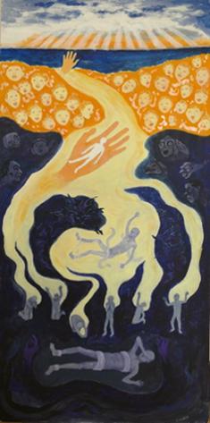
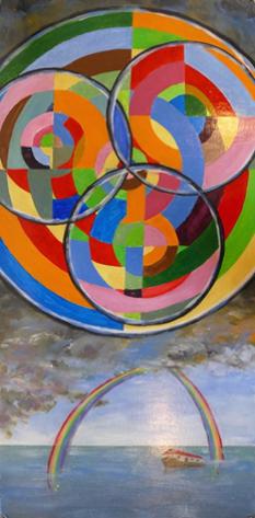
There's nothing like a difficult text however to get us combing through it for pictorial potential. And sure enough, there was plenty there once one started digging.
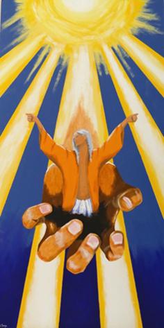
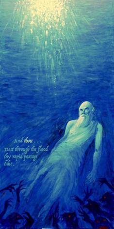
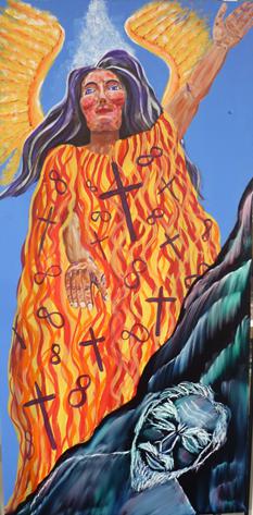
John Jarratt was tempted by 'Demons, low born clods of brute earth' but in the end opted for a more ethereal subject - 'And thou . . . dost through the flood thy rapid passage take'. This was also the subject selected by Amber Richards; we therefore had two different interpretations of the same text.
Paul Swinge |
Margo Ward |
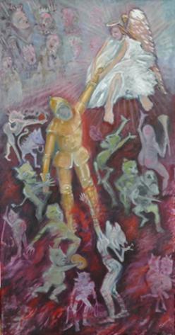
Janet Benge could not resist ‘close to the judgement court that sullen howl from the demons who assemble there, hungry and wild, to claim their property, and gather souls for hell’. Yes, that sounds like Janet all right.
Janet Benge |
John Jarratt |
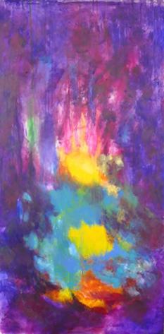
Paul Swinge spotted the possibilities of 'someone has me fast within his ample palm' and Margo Ward decided to go for a general depiction of the heavens and celestial bodies. Jenny Stratfold successfully managed to show multiple scenes of Gerontius’ journey from near death towards Heaven under the title of 'Rouse thee my fainting soul ...prepare to meet thy God'. As for myself I went for a Sonia Delaunay treatment of 'God is Three, and God is One' then added for good measure a touch of 'Noe from the waters in a saving home'.
Amber Richards |
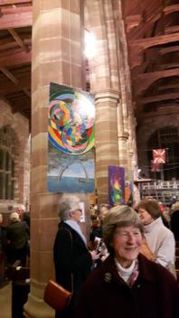 |
As always the resulting 7 pictures were a mixture of artistic styles and emotional responses to the composer’s work. Hanging down the pillars of the central aisle the pictures looked spectacular. They gathered much praise from the large audience, and a request from the vicar of All Saints that they remain in place over the Easter weekend. So a great opportunity for Hertford Art Society to link up with the town.
Geoff Bennett
Demonstration & Workshop – Abstract Art by Chantelle Stephenson – 8th March 2016
 Chantelle Stephenson is a professional artist who specialises in abstract painting, printmaking, drawing, alternative photography techniques and felt making. She teaches at "The Settlement” in Letchworth where she offers a variety of courses in different art forms. Chantelle has had her work shown in a London Gallery and has travelled to Japan recently where her style of working has been of great interest to the Japanese artists. Obviously she has also brought back a lot of new ideas from that country which will no doubt be shown in her future art classes.
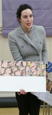
Chantelle began with a short talk (illustrated with images on her Ipad) on how best to approach this subject and create an abstract work from either still life or from an interesting picture. As a starting point, we made a quick drawing of the chosen subject. We then divided another sheet into 6 small squares or rectangles and, using a small viewfinder on the original sketch to isolate interesting shapes, drew each of these new images onto the paper to create some interesting abstract forms. Chantelle advised us to keep to simple outlines that were of interest to us in order to make this work and to rotate the viewfinder, thus changing the relationships of the various images. She herself did one such picture in order to give us an example of what the end result could look like.
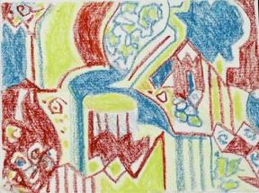
The next step was to use colour (in a fairly restricted palette) and to paint or colour the resulting 6 small images. Chantelle moved around the hall helping individuals and gently guiding them to do what was required in order to understand how this whole process worked. One of the images could then be selected and reproduced to a larger scale on a further piece of paper or canvas - in any chosen medium. The photo shows the varied and dynamic work which this workshop produced.
This approach of Abstract art (seeking an abstract form from a representative source) was a new skill for many Members and Chantelle was thanked for a very inspiring and enjoyable evening.
A Story of Three Colours in Art- Red White Blue Illustrated Talk by Alexandra Epps – 1st December 2015
We were delighted to welcome Alexandra Epps, a graphic designer, NADFAS lecturer and City of London Guide, to Hertford Art Society. Alexandra is experienced in guiding tours of Public Art and Architecture of the City of London as well as the collections in Tate Modern and Tate Britain.
The talk focused on three colours - Red, White & Blue and Alexandra explored how colour impacts on our perception of art with a wonderful array of paintings as illustration. (Two images from each section are shown here as examples - many are well-known and can be easily sourced on line.)
|
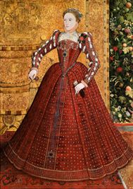 Van Hervijk - Elizabeth I (1560) |
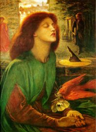
Red - one of the most powerful colours associated with passion, aggression and obsession. We speak about “seeing Red” in anger. Historically it is an earth colour, appearing on cave paintings, Roman frescoes and the rich backgrounds of Greek vases. It is also a rather “British” colour - think of London’s buses, phone and post boxes. Red is definitely used to draw attention. Alexandra’s selection of images began with Botticelli’s Birth of Venus (1480s), a very sensuous painting with flowing red hair enveloping the rising figure of Venus. Auburn locks are also the main event in many portraits by Rossetti, for example Beata Beatrix (1872) which was a memorial to his wife who, sadly, committed suicide. This painting contains a red dove (symbolising death) holding a white poppy to signify opium and an angel in red holding a flame. It is all about love and loss.
We moved back and forth through time to look at various images:
- Elizabeth I by Van Hervijk (1560) in which the Queen was dressed in a rich red gown - a colour only worn by the nobility and a statement of power. A red rose surrounded by oak leaves adorns her shoulder - this a reference to her lover Dudley;
- Anita Berber by Otto Dix (1925) - a full length portrait of an outrageous drug addicted dancer of the 1920s clothed in a red dress against a red background. She was only 26 years old when this was painted but looks old and haggard - the use of red gives a malicious edge to this portrait;
- A Sick Child by Edvard Munch (1885) - a series in which red ink or paint is used to portray his dying sister in an era beset with tuberculosis - an image of grief with red being the colour of blood;
- 3 Studies at Base of Crucifixion by Frances Bacon (1965) uses a red background to cast an eerie light over the threatening, animal-like creatures;
- The Bacchus series by Cy Twombly - huge, expressive, loosely drawn loops of dripping red paint on a neutral ground from the late 1970s.
- Finally, we looked at Red used in “protest” art in the work of feminist artist Barbara Kruger’s Your Body is a Battleground, again in the 1970s.
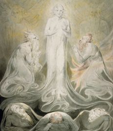 The Transfiguration by William Blake (c.1800) |
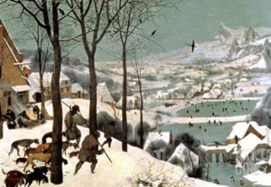 The Hunters in Snow by Pieter Breugel the Elder (1565) |
In the next section Alexandra displayed a screen of images where White was the dominant “colour”. This is the colour of snow, of mourning, of innocence, honesty, cleanliness, perfection, spirituality. White became symbolic between WW1 and WW2 as a reference to peace.
We looked at:
- The Transfiguration by William Blake (c.1800) with soft golds, greys and white representing the bridge between heaven and earth;
- White on White by Kazimir Malevich which was painted in 1918, a time of immense change in the artworld, a time when artists and architects wanted to explore afresh the perceptions of art.
- The Hunters in Snow by Pieter Bruegel the Elder (1565) depicting weary hunters in the foreground with a snow covered landscape beyond - a very “cold” image.
- Haystacks (Effect of Snow and Sun) (1890) by Claude Monet - this series explores the many shades of white with glorious cast shadows;
- Symphony in White, White Girl Nos 1-3 by Whistler 1862. This series caused great consternation and was rejected by the Royal Academy - Whistler was going through a white period which echoed in his wardrobe and his choice of dogs! He was the first to create white gallery spaces for his work;
- An example of one of Piet Mondrian’s compositions with black lines on a white ground with red, yellow and blue squares or rectangles (he hated green) was shown. His work began with nature (see his early trees) which became more and more abstracted in the 1920s and 30s into a balance of positive and negative shapes on the canvas - a trend which was also found in early 20th century architecture.
- White Reliefs (1933) by Ben Nicholson with their sculptural quality of hand cut shapes and cast shadows. These were icons of the 1930s and he was influenced by the work of Mondrian and Le Corbusier whose designs emphasised the importance of light, both cast onto and into buildings.
- Finally, we looked at a slashed canvas by sculptor Lucio Fontana (1950s) - a plain white canvas with “cuts in space” to create a 3D image. He called these works Spatial Concepts “Art for the Space Age”.
|
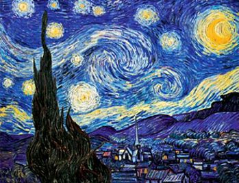 The Starry Night by Vincent Van Gogh (1889) |
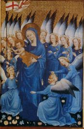
Alexandra then asked Members to think about the colour Blue. It is associated with the unfathomable depths of the ocean and the immensity of the sky. It is soulful and can signify depression - “The Blues”. In Christianity it is at one with the image of the Virgin Mary and originally a very expensive pigment made from Lapis Lazuli. The Wilton Diptych at the National Gallery is a glorious example painted in Tempera on wood by an unknown artist c.1395.
We then looked at:
- The Starry Night by Vincent Van Gogh (1889) depicting the view from his room in an asylum with much added from his imagination. The surface is richly painted with highly charged brushstrokes. It is thought that the cypress tree may signify death set against his representation of heaven.
- In The Large Blue Horses by Franz Marc (1911) blue was used for masculinity and spirituality. It is a powerful image with the rounded horses set in a brightly coloured landscape.
- Blue by Wassily Kandinsky (1927) is an unusual study of a blue sphere on a dark blue ground (with a tiny red dot in the corner). He felt that the circle is the most peaceful shape and represents the human soul. This artist could “see” sound and “hear” colour (a condition called synesthesia);
- La Vie by Pablo Picasso, produced in 1903 during his Blue Period. Scholars agree, that it is one of the most important works Picasso ever created - he was endeavouring to paint his way out of the grief of losing a dear friend;
- Under the Wave off Kanagawa by Hokusai (c.1830) - a woodblock print illustrating the power of nature using Prussian Blue;
- A Bigger Splash by David Hockney (1967) shows a warm Californian moment in time, painted primarily with rollers for a smooth, poster-like finish;
- Performance art by Yves Klein who developed his own International Klein Blue and produced a series of images by covering models in paint and having them roll or print shapes of themselves onto canvas;
- Lastly, we enjoyed viewing the Blue Nudes, papercuts by Henri Matisee (1952), simple and elegant figures produced in his late period.
This was a fascinating tour around a diverse collection of artworks, looking at them from the point of view of the dominant colour. Alexandra was thanked for presenting such an intriguing collection of paintings and sharing with us her extensive knowledge and insight into these artworks. It was an extremely enjoyable and thought provoking evening.
Kathy Burman
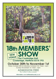
Review of Members’ Show - 30th October - 1st November 2015
This year, for the first time, Hertford Art Society members held their annual show at their regular meeting place - Cowbridge Hall, Cowbrige, Hertford, SG12 1PG. In its new premises the Members’ Show took on a whole new look – lots of light flooding in, room for double the number of pictures of previous shows, and a layout that beckoned you around each set of panels like a garden full of nooks and crannies. This larger venue meant that were able to exhibit more and larger artwork and 68 artists contributed 230 framed and 3D pieces as well as browsers full of unframed work and an exciting selection of greetings cards.
Strewards offered coffee, tea and cakes and the result was a totally relaxed and friendly show enjoyed by a good stream of visitors each day. If they didn’t feel like buying a picture there was always a good selection of colourful cards to browse through.
Left: John Godden Award - Members' Choice - Dusk, Woolmer Green Pond by Andrew Clarkson - Oils;
Right:
May Bennett Award - Still Life with Fruit and Flowers by Maureen Batty - Mixed Media
| Awards were made to Andrew Clarkson for his ‘Woolmer Green Pond at Dusk’ (Members award); Maureen Batty for her ‘Still Life with Fruit & Flowers’ (Best Still Life); Marianne Dorn for her galloping horse: ‘I fight the Demons’ within’ (Visitors Choice); and Fiona Pruden for her ‘Forest of Love’ (Most intriguing work). ‘I fight with Demons’ was also runner-up in the Most Intriguing work award and this image by Marianne Dorn and 'Forest of Love’ by Fiona Pruden were lessons in the economy of brushwork that reinforces the ‘less-is-more’ mantra. Maureen Batty’s ‘Still Life with Fruit & Flowers’ demonstrated the power of a good Ink Wash and Andrew Clarkson’s Woolmer Green Pond breathed a gentle Summer’s evening. |  Visitors' Choice Award - I fight the Demons within by Marianne Dorn - Ink |
Most Intriguing Work - Forest of Love by Fiona Pruden - Watercolour
Among the other exhibits, the following really stood out:
- - June Pickard’s ‘Circus Acrobat’ was delightful – negative spaces emerging from the views between arms, legs and torso of the 3D model
- - Amber Richards’ two ‘Fantasia’ models deserved to be snapped up at the modest prices she was setting
- - Ray Ward’s watercolour of Hertford Basin was bought by Hertford Museum, no doubt to become part of the Museum’s pictorial record of Hertford; a splendid accolade.
35 pictures were sold - 27 framed and 8 unframed together with many greetings cards - all of which were respresentations of Members’ artwork or original images. This compares with last year’s figures of 22 sold (8 framed and 13 unframed). So we did a lot better in the new premises. This successful Show was made possible by the efforts of many Members and thanks go to all who helped put up and take down the show, baked cakes, dispensed refreshments or acted as stewards.
Geoff Bennett
Demonstration – Boat Shed at Richmond in Acrylics by Derek Daniells RBA – 13th October 2015
A member of the Wapping Group of Artists, Derek Daniells is a professional artist who uses a variety of mediums such as oil, acrylic, mixed media and pastel with equal skill on a wide range of subjects. He prefers direct observation, often working on site in all weathers. He aims to complete his paintings in one session and travels extensively, seeking out subjects which excite his eye. He loves working along the Thames and chose to demonstrate an interior scene of one of his favourite boat sheds in Richmond.
Working from a photograph, Derek initially lays down some dilute washes of acrylic in shades of grey, ochre and blue, defining some key shapes of the scene. He likes to paint on mdf board which has been primed by up to four coats of acrylic gesso. These are robust and easy to transport. His chosen palette is: Cadmium Yellow/ Orange/ Red, Yellow Ochre, Burnt Sienna, Naples Yellow, Ultramarine Blue, Cerulean Blue and Phthalo Turquoise.
Once the initial abstract shapes are established, the drawing of beams and structures are loosely added. Working over the whole surface quite thinly and loosely, Derek gradually adds dark and light areas in blocks, adjusting the drawing and preserving the lighter areas. The image is developed with areas of shadow in tones of grey and the beams and boats defined in warm browns. Gradually the forms take shape with touches of light defining the objects - still with transparent colours using a stay-wet palette. Changing to a regular palette, Derek began to apply denser paint and the image took on a more solid appearance.
Derek aims for colour harmony and subtle tones and tries to simplify the image with suggestions of the clutter which abounds in the boat house. He uses touches of colour throughout the painting and works in different areas, allowing the paint already applied to settle and dry a little before reworking. He admits to loving the Phthalo Turquoise which is just right for a bin in the foreground and has to restrain himself from overusing it elsewhere.
The focus of the painting is on the doorway in the lower right section - a glowing area which attracts the eye, from which it explores the forms of the boats, the beams on the ceiling with stored pieces of wood and the curved, boat shape of the shed itself before taking in the interesting foreground. The demonstration was completed by the addition of highlights and lowlights, creating depth in the painting.
It was a pleasure to watch Derek demonstrate his approach to painting and everyone learned from it. He rapidly created an image that was intriguing and full of atmosphere and engaged with Members in discussing his work and techniques.
This was a very enjoyable evening and Derek was warmly thanked for giving us all such an inspiring demonstration.
Visit to County Hall Hertford with Blue Badge Guide – 29th September 2015
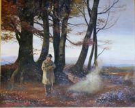
Members of Hertford Art Society gathered at the main Hall where the two striking stag sculptures stand either side of the entrance. Our Blue Badge guide for the evening was Elizabeth Eastwood and we began the tour at the archive and family tree room in which hung 3 beautiful landscape paintings by a local painter Edward Archibald Brown. Member Trevor Chamberlain, who is a fan of the Artist, gave us a brief history of Brown’s life. He had also brought in a folder with some original sketches by Brown. It was also in the archive room we saw a lovely painting of a farmer burning leaves in Ashridge by the “well-known painter (pause for it) Anon”, Elizabeth joked.
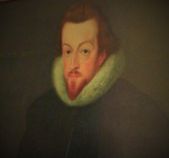
We returned to the main building and went up to the gallery above the ballroom, which is off limits to the public, which was an exciting privilege. Here were several historical paintings of men who had links to Hertfordshire. It was also noted that most were not originals but copies of the originals, and one of the Copyists was Edmund Dyer. This was apparently the done thing in those days, as copies were of course much cheaper (just like today’s artist John Myatt, who does copies of other artist work for a fraction of the price). One of the copies is of Robert Cecil, 1st Earl of Salisbury and Secretary of state to Queen Elizabeth I, and who had resided at Hatfield House, which was also the childhood home of the young Elizabeth.
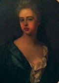
Next stop was into a darkened corridor, somewhere you would not want to be alone at night, where torches (or a mobile phone) lit the paintings up showing off their beautiful details. One of the paintings was of Sarah Churchill (a woman of much influence and friend of Queen Anne of Great Britain) born in St Albans and wife of John Churchill, 1st Duke of Marlborough, whose own painting was up in the gallery, both paintings done by Edmund Dyer.
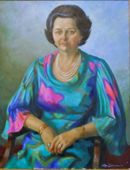
In the ballroom were many paintings and photographs of county court officials in suits, accept for one. This was Dame Betty Patterson (JP, Chairman of the County Court) in a lovely blue patterned dress, painted by Olga Lehmann. Lehmann was a Chilean born British Artist who was known in the 30s for her mural paintings and portraiture. Over the years she had painted many well-known people, such as John F. Kennedy, Dirk Bogarde and Patrice Wymore. She also did graphic design for the Radio Times and designed for the film and television industries.
The staircase from the ballroom is adorned with many paintings, mostly of people that have some connection to Hertfordshire, and one of the Queen, and a towering one of the younger Queen Mother, who was of course Queen at the time of painting.
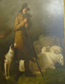
Finally, we head into the Vault room, where there are a few large paintings to admire. The painting that currently has pride of place is “The Shepherd” by Richard Westall R.A. (1765-1836). This is a splendid painting of a shepherd and his dog and a few sheep, which is currently on loan from Hertford Town Council. And so ended our wonderful tour. And many thanks to our Blue Badge guide and Hertford County Council for an interesting and information packed evening.
The collection of paintings in the public areas can be viewed by visitors when County Hall is open during the day. The ballroom gallery is off limits, but you can view them from a distance in the ballroom. Alternatively, you can see most of the paintings at the BBC Your Paintings website, following the links to County Hall Hertford.
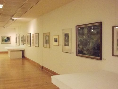
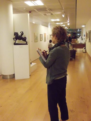
Visit to Gibberd Gallery - 15th September 2015
This year‘s Winter Programme includes three evenings which have been arranged at interesting local settings and the first of these was a visit to the Gibberd Gallery in Harlow Water Gardens.
- 2015sep-gibberd-gallery-01.jpg
Reproduced with permission of The Gibberd Gallery.
- 2015sep-gibberd-gallery-02.jpg
- 2015sep-gibberd-gallery-03.jpg
The Gibberd Gallery is a purpose built contemporary exhibition space in the centre of Harlow on the mezzanine floor of the Civic Centre. It is run by Harlow Art Trust, a charity formed in 1953, which also commissions and purchases sculpture for the town. It is home to the important collection of British watercolours donated to the town by Sir Frederick Gibberd in 1984. This collection is permanently on display and includes pieces by John Nash, Edward Bawden and Elizabeth Blackadder.
The Gallery Director, Corinna Dunlea gave an interesting talk on the origins of the Gallery and the importance of art in the original concept of the design of Harlow by the architect Sir Frederick Gibberd. There are currently 79 public sculptures situated throughout Harlow.
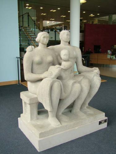
Members then spent the evening looking closely at the permanent collection of watercolours and sketching the various sculptures, including Harlow Family Group 1954 by Henry Moore, an imposing larger than life work in Hadene Stone which greets visitors to the Gallery.
The gallery also has a variety of on-going temporary exhibitions worth looking out for and it is open and free to all visitors - very conveniently situated between Asda and Matalan in Harlow town centre.
Archive PROGRAMMES
Winter 2015-2016 programme
Visitors 2015-2016 programme
Summer 2015 programme
64th Open Exhibition prizewinners, 2016.
The John Goss Prize for Best in Show,
Stella Green,
'Hydranga'
Lady Laming Award for Abstract Art,
David Quantrill,
'River Bank'
The Bill Dale Award,
Trevor Chamberlain,
'Old Blue Coats School Hall'
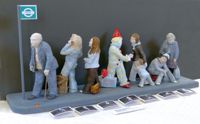
The Mayor’s Award – best 3D work,
Maria-Luisa Wilkings,
'Queue of Life'
The Edward Mason Award – Best Watercolour,
Anne McCormack,
'Instant Colour'

Visitors' Choice Award, Jill Rolfe, 'Show me the way to go home'
Winners of Critique Sessions 2015-2016 season
John Jarratt,
April 2015,
Barns At Therfield - Watercolour
Jean Holford,
October 2015,
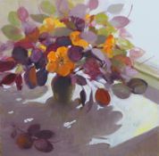
Nasturtiums - Oils
Stella Hunt,
November 2015,
Hazy Pond at Myddleton - Mixed Media
Peter Buck,
December 2015,
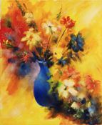
Blue Vase - Oils
 David Stowe,
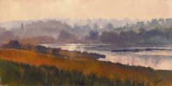
January 2016 - Joint Winner,
November Morning, Lady Hughes Lake -
Oil
David Stowe,
January 2016 - Joint Winner,
November Morning, Lady Hughes Lake -
Oil
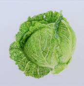
Fay Donohoe,
January 2016 - Joint Winner,
Savoy Cabbage - Watercolour
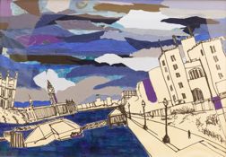
David Nelson,
February 2016 - Joint Winner,
View From Lambeth Bridge - Mixed Media
Marianne Dorn,
February 2016 - Joint Winner,
Dahomey 2 - Collage
David Stowe,
March 2016 - Critique Winner,
Mimram Sunset - Oils