Visit to Henry Moore Foundation -14th July 2018
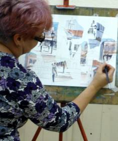
A small group of artists from the Society enjoyed an extensive pre-arranged tour of Exhibitions, Studios and Gardens at the Henry Moore Foundation at Perry Green, Much Hadham. Our Guide, Diana Dale, was extremely knowledgeable about the life and times of Henry Moore and gave us an insight into his early life and emergence as a sculptor, his working practices and the themes his work followed throughout his career.
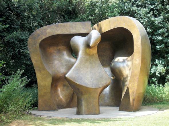
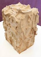
Large Figure in a Shelter 1985-86
The current Exhibition - Out of the Block - displays some of his early carvings alongside later pieces which echo his abiding themes. These are: the reclining figure, mother and child and forms within forms. (This Exhibition runs until October 2018.) There are huge sculptures within the grounds and many in the various studios that we visited - they ranged from a tiny dog (his first effort at sculpture) and grew in size over the years to spectacular forms to walk around in, such as his last sculpture, Large Figure in a Shelter, 1985-86. Depending on location and commission some had to be made at foundries abroad and at home.
Henry Moore started with wood carvings initially and he moved to Perry Green after his flat in Hampstead Heath was damaged in the Blitz. He worked and lived here for the rest of his life and was also buried not far from this home called “Hoglands" - as it was a pig farm when he bought the land. The original small house and garden were added to over the years as neighbouring land became available (and his finances improved).
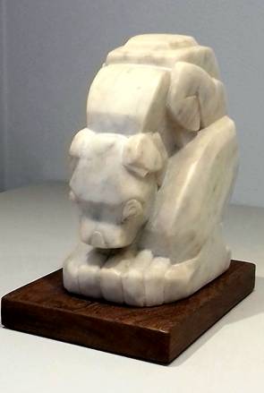
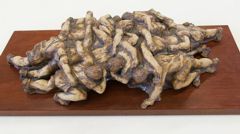
Left image: Family Group 1954 -Hadene Stone - displayed at Gibberd Gallery, Harlow. Right image: Dog, 1922 - Marble
Born in 1898, Moore died in 1986 and at his peak he was as famous for his monumental artistic sculptures as Churchill was known worldwide for his success in WW2. He was born in Castleford, Yorkshire and his Father worked in a coal mine. He was encouraged by a tutor in college and a new sculpture department was formed especially for him to work in. His life’s work spans from wood carvings to stone and marble and all that is in-between. Later works were fashioned initially from polystyrene in order that moulds could be made for the final piece, usually in bronze. He loved working in one of the studios which overlooked a field with grazing sheep and drew them often. He is also well known for his drawings, including those in air -raid shelters during World War II. Some of his drawings have been transformed into magnificent tapestries currently displayed in a barn which was relocated from a nearby farm.
A new Exhibition hall gives his life story in pictures some taken by himself as he was an accomplished photographer. He was a friendly and generous person who managed to reach great heights within his lifetime which is rare for an artist.
The Foundation was established in 1977 and welcomes visitors from around the world as well as many schoolchildren who cannot fail to be entranced by this stunning treasure trove of ideas made real by such a gifted and prolific artist. His past association with the Hertford Art Society is something to be proud of. Many thanks to Trevor Chamberlain for arranging this very enjoyable trip.
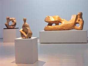
Left image: Out of the Block Exhibition with Reclining Figure 1959-64 on right. Right Image: Reclining Figure by Henry Moore - 1964 HAS Exhibition
Comments from Trevor Chamberlain:
“I was delighted to join in the recent visit to the Henry Moore Foundation, which for me brought back happy memories of Henry Moore and his involvement in the early days of the Hertford Art Society. The Society was inaugurated in 1953 with Mr Moore agreeing to become one of our Vice-Presidents, a post he held for nearly 20 years. Every year he readily agreed to lend a small work to grace our Annual Exhibition, held at the Corn Exchange, Hertford, and so two members would travel to Perry Green beforehand to implement this and, sometimes, I was lucky enough to be included.
Our recent guided tour started off in the Studio (a converted barn next to Hoglands) and I was immediately transported back to the late 1950s and 1960s when our little delegation would invariably be welcomed by Henry Moore in this very Studio, in order to choose a suitable work be it a maquette, drawing or lithograph.
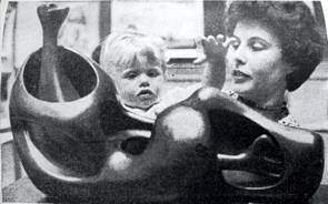
The photograph shows “Reclining Figure” by Henry Moore (taken from an article in the Hertfordshire Mercury), which was the highlight of the 1964 Exhibition. Other exhibitors that year included Victor Askew, John Piper, Ronald Maddox, Ashley Havinden, Graham Rust and Michael Evans.”
2017-2018 Critique Winners
Critique winners of the 2017 – 2018 season as chosen by Members
 Bill Dean April 2017 Display Cabinet 13 - Oil |
 Craig Lee September 2017 Evening Stroll, Southwold - Oil |
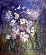 Shirley Keeble 3 October 2017 - Joint Critique Winner Windflowers - Acrylic |
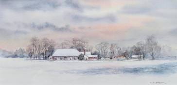 Heather Brown 3 October 2017 - Joint Critique Winner Barn In Snow, Birchanger - Watercolour |
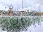
 Linda Radford Joint Winner 31 October 2017 Woodbridge - Watercolour |
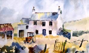 Michael Radley Joint Winner 31 October 2017 The Old Farm - Watercolour |
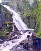 Pauline Hazelwood Joint Winner 31 October 2017 Waterfall - Oil |
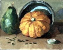 Craig Lee Joint Winner November 2017 Munchkin Pumpkin - Oil |
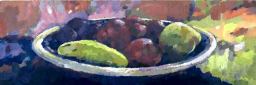 Chris Hewitt Joint Winner November 2017 Fruit Bowl - Acrylic |
|
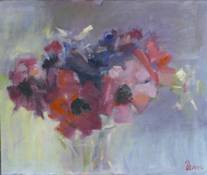 Bill Dean January 2018 Critique Winner Anemones - Oil |
|
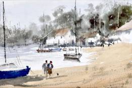
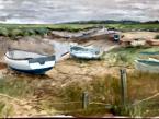
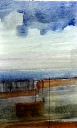
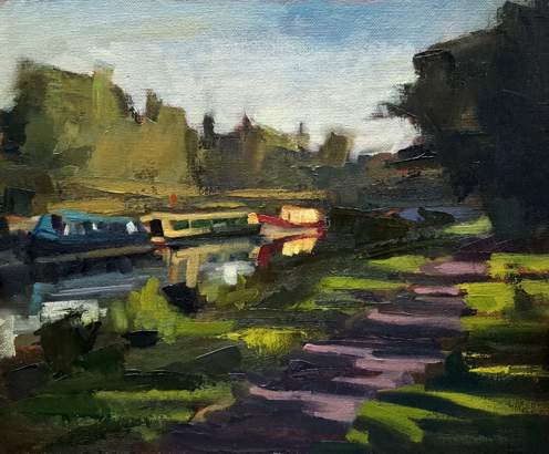
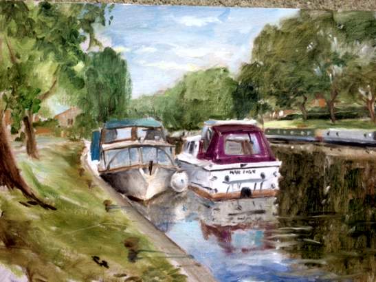
Summer Painting Weekend
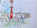
Blakeney, Norfolk - June 8th, 9th and 10th 2018
Work from John Jarratt
The charming coastal village of Blakeney was historically a medieval commercial port transporting spices and oriental cloths, as well as a few smugglers! The estuary today is an amazing landscape of marshes, mud banks and sand hills. It made an ideal venue for the Hertford Art Society annual art weekend.
Malcolm Norris from Lea Valley Art Society joined us on our trip to Blakeney. Inviting other art groups is something we will continue to do in future as it opens up the club to all who are interested in painting outdoors. So feel free to invite others.
Malcolm Norris from Lea Valley Art Society
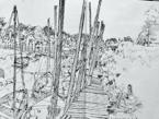
The members who took part all agreed that Blakeney was ideal for painting, it would have been better if the sun had shone on Friday and Saturday but still it managed to do its job on the Sunday enabling me to produce a pallet knife oil painting of the harbour.
Work from Stephen Lowe
The dining experiences were memorable with an above average Fish & Chip meal on the Friday night in the White Horse followed by a top notch private function at the Blakeney House Boutique B&B. The chef excelled himself and for the second year HAS members gave the Chef a round of applause at the end. Accommodation at the Blakeney Manor Hotel was comfortable and well priced.
Next year we are thinking of discovering Aldeburgh and plan to take in Snape Maltings. Depending on what’s on we may go to a concert. This will take place on the first full weekend of June 2019 so please book it in your diary. Members will be advised as soon as details are available. Remember, feel free to bring non painting partners and/or painting friends.
Stephen Lowe
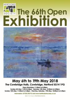
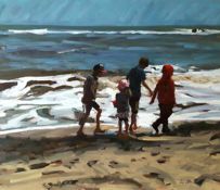
Hertford Art Society 66th Open Exhibition 2018 - May 6th - 19th
The style of this Exhibition varies year by year. The selection of work for a place in the Exhibition is made by a panel of four eminent, practising artists who are completely independent of the Society. This year we were delighted to welcome Abel Kestevan, David Sawyer and David Ord-Kerr as judges for 2D work and Jim Brown as the judge for 3D items. The range of expertise and opinion of the judges and the wide variety of work submitted each year, ensures that each show has a unique mix of artworks. This year 145 artists submitted 562 items for consideration. 269 2D works were selected for hanging and these, together with 27 sculptures and 3D items provided visitors with a diverse, colourful and exciting 66th Open Exhibition at Cowbridge Halls.
The exhibits included etchings, lino and screen prints; digital images; oils, acrylics and watercolours; pastel, pencil, charcoal and ink; collage; 3 D works in a variety of materials. A quiz helped to keep children engaged as they searched for elusive entities. There was something for everyone: atmospheric landscapes, townscapes and seascapes, abstracts, figures busily texting, storytelling or on a busy pedestrian crossing., still life images (abundant fruits, flowers, melons and jugs), butterflies, puffins and elephants. Some works were delicate, others rich in colour and boldly executed. Many, this year were in monochrome, ranging from large pen and ink scenes to exquisite life studies in pencil. Additional works were displayed at other venues in Hertford.
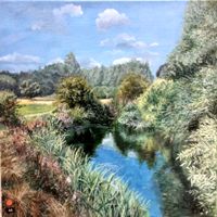
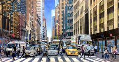
Open for an entire fortnight the exhibition attracted many visitors from a wide area. Hundreds of visitors cast their votes for their favourite exhibit - the winner was Storm over NYC by Chris Hewitt. The joint runners up were The River Beane, Hartham Common by Fiona White and 42nd and Lexington by Michael Lawrence.
Thanks go to all the people who contributed in making this, the 66th Open Exhibition, such a success - it was another exciting and popular show.
Award Winners
- The John Goss Prize for the painting the judges considered best in show - 'Punk Portrait', William Carney.
- The Lady Laming Award for Abstract Art - 'Still Life', Brian Innes.
- The Bill Dale Award is chosen from works by Members who regularly support the whole of the Society's activities - 'Blue Storyteller', Marianne Dorn.
- The Mayor's Award for the best 3D work sponsored by The Arts Society East Herts - Crouching Hare', Anne Gascoigne. Commendations were awarded to Kathy Burman for “Labyrinth Echo” and to Maria-Luisa Wilkings for “TheScrum”.
- The Edward Mason Brushes Award for the best watercolour - 'Vaporetto Venice', Andy Lee.
- Visitors’ Choice Award - ‘Storm over NYC”, Chris Hewitt. The joint runners up were The River Beane, Hartham Common by Fiona White and 42nd & Lexington by Michael Lawrence.
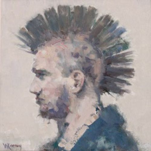
John Goss Prize for Best in Show, William Carney, 'Punk Portrait'.
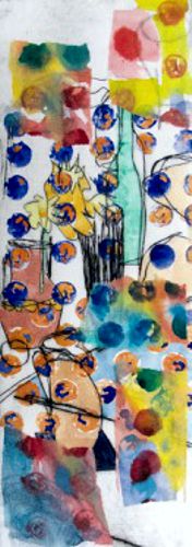
Lady Laming Award for Abstract Art, Brian Innes, 'Still Life'.
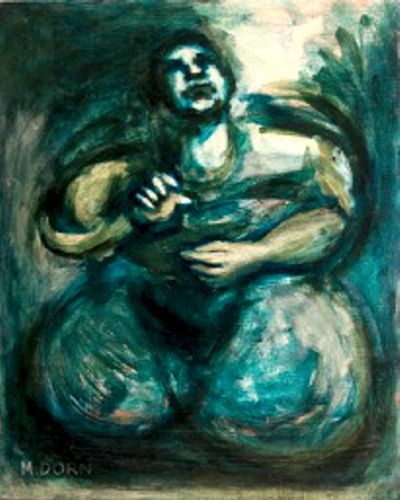
Bill Dale Award, Marianne Dorn, 'Blue Storyteller'.
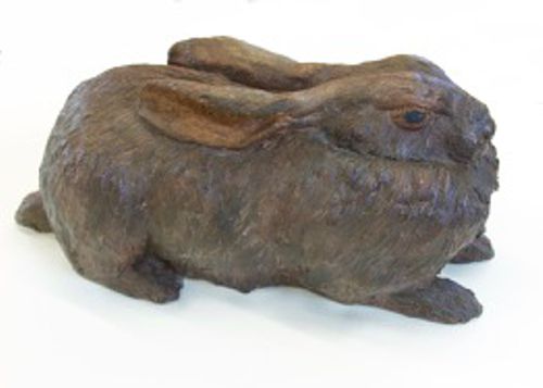
The Mayor's Award – best 3D, Anne Gascoigne, 'Crouching Hare'.
 Commendations were awarded for The Mayor's Award – best 3D Kathy Burman 'Labyrinth Echo' |
 Commendations were awarded for The Mayor's Award – best 3D Maria-Luisa Wilkings for 'TheScrum' |
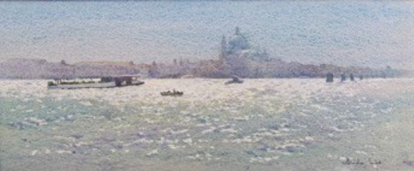
The Edward Mason Brushes Award – Best Watercolour, Andy Lee, 'Vaporetto Venice'.
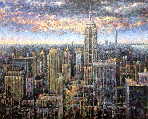
Visitors’ Choice Award, Chris Hewitt, ‘Storm over NYC'.
 Joint runners up Visitors’ Choice Award Fiona White 'The River Beane, Hartham Common' |
 Joint runners up Visitors’ Choice Award Michael Lawrence '42nd & Lexington' |
Self-Portrait Workshop - 24th April 2018
20 or more artists ventured along (somewhat nervously) to this Workshop armed with pencils, paints etc and each with a mirror. Each set up their mini-studio, some with rather smart mirrors on stands, others with small mirrors attached somewhat precariously to the top of an easel with masking tape. After settling in, a hush descended as each of us made tentative marks on canvas or paper in order to start this most challenging of tasks.
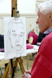
We measured, gauged angles, tried out positions and wondered if Rembrandt and Van Gogh ever felt this anxious when face to face with themselves. Some of us stuck to pencil and charcoal, others mixed paint, and fretted about colour and tone as well as whether both eyes were the same size.
Creating a self-portrait is so different to drawing or painting a model. We are fortunate, as a Society, to often have Life Workshops, giving us the opportunity to study the human face and form and observe the planes, angles and colours as we work. Modelling for oneself is a whole other thing. You need to come back to exactly the same position, having looked down at your work. A serious face is the only possibility, and who likes one’s own serious face?
At times the work went well, and just as you thought you were winning you realised that your nose was much too long! There were a few groans and giggles. We soldiered on and displayed the work at the end of the session for all to see. They were all so different and, yes, many actually looked like the artist. All had great character.
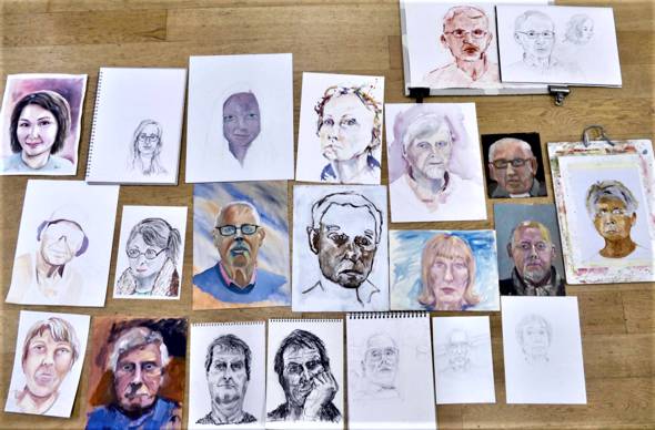
This Workshop was unusual. There was no tutor. The silence was deafening as each artist concentrated on finding just the right line to express something about themselves. It was an introspective and thought-provoking exercise and certainly increased our respect for artists who have accomplished some of the great self-portraits of the past.
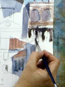
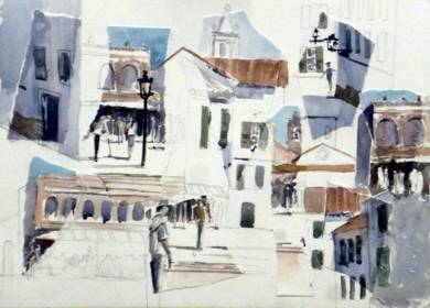
Artist, Trevor Chamberlain, visits Bengeo Primary School - March 2018
“Good afternoon, Mr Chamberlain!”
This was the chorus of welcome from two classes of 7 - 9 year olds at Bengeo Primary School in mid-March. Headteacher, Mrs J Starkiss had previously contacted me to say that the school had discovered my paintings on the Internet, had used them as visual aids in art lessons, and that it would be fantastic for the children to be able to meet a “real live artist” and to see some pictures first hand.
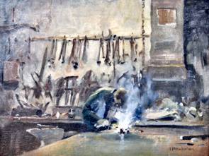
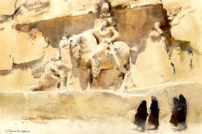
Left: Arc Welding, Forge in Doncaster. Right: Nagshe-Rostam, Nr. Persepolis, Iran.
After a little “arm-wrestling” I agreed to come to the school and conduct the visit on the basis of a Question & Answer format. I commenced with the pupils sitting on the floor listening to me giving a brief outline of my career. They were fascinated to know that I too attended Bengeo Primary School, albeit when it was located next to Holy Trinity Church and the boys and girls were separated but that was a few years ago now!
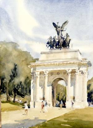
Wellington Arch, Hyde Park Corner, London.
My presentation attracted numerous questions and responses especially when I displayed a variety of unframed examples of on-site oils and watercolours depicting a range of subjects - for instance, India, Iran, local landscapes, architecture, interiors and flowers.
Both classes were very attentive, interacted well, and, I am sure, thoroughly enjoyed the experience. At the conclusion I was treated to another chorus: “Thank you Mr. Chamberlain!”
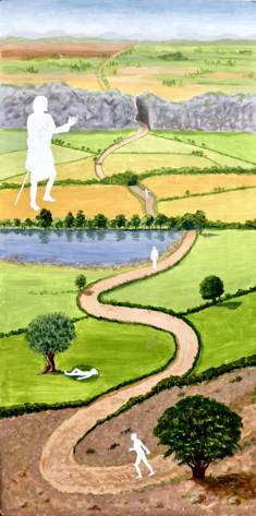
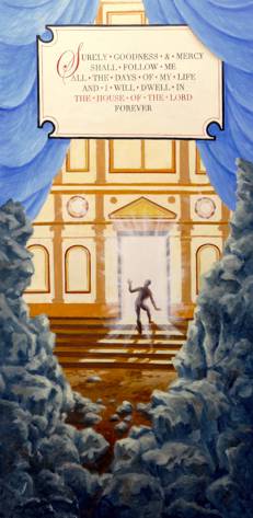
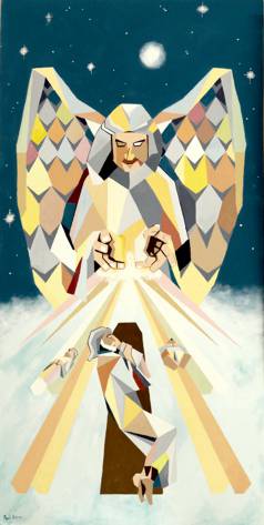
Rutter-Requiem and Bernstein-Chichester Psalms
All Saint’s Church, Hertford - 24th March 2018
The Hertford Art Society has been painting pictures for the Choral Society’s Spring concert since 2008 – about 60 pictures and counting. Some years the task has been relatively straight forward: in our first year we went to work on Handel’s Creation which was a delight, with ‘every living creature that moveth’ and Adam & Eve at home in the garden of Eden. 2013 saw Mendelssohn’s Elijah which also had some great pictorial opportunities - ravens feeding the prophet; and his subsequent flight to heaven, conveyed in ‘a fiery chariot with fiery horses’. Other years the challenge has been much greater – this year for example we have three texts deeply introspective, and with a minimum of landscapes, characters or action to set one’s paintbrush alight.
Anthony Parke |
Brenda Thompson |
Geoff Bennett |
Janet Dobney |
We search the libretto for meaning but even the familiar texts are difficult to bottom out: a table is prepared before me in the presence of mine enemies, my head anointed with oil and my cup runs over. The combination is surreal, which suggest one artistic response. Or does one take a literal view and paint a delightful Dutch still life of a table laden with food and drink: but where to put the enemies, let alone the anointing of the head?
I’d like to say we stand back to consider the big themes in a libretto, but more often it is either a moment of drama that catches the eye – let there be light! (The Creation), a rock splits open (St John’s Passion), fire mingles with rain (Israel in Egypt); or a telling detail: a little cloud like a man’s hand (Elijah), a sullen howl (Dream of Gerontius) or, my all-time favourite, the combine harvester that Persis smuggled into her picture of ‘the farmer waits for the precious crop’ (German Requiem).
Jenny Stratfold |
John Jarratt |
Paul Swinge |
Rehearsal |
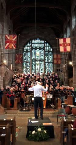
The collaboration between our two Societies over the last 10 years has been a happy and creative one; we look forward to the next decade of painting difficult texts!
Geoff Bennett
Demonstration by Simon Pemberton - Illustrator and Artist
20th March 2018
Is there a difference between illustration and fine art? Simon Pemberton is an artist whose illustration work has been commissioned by a wide variety of major design, publishing and advertising agencies worldwide. He was born on the Wirral near Liverpool, studied at Central St. Martin's College of Art and now lives and works in London's East End with a studio overlooking London fields. He was much inspired by Andrew Wyeth and landscape figures quite significantly in his work.
Simon originally worked in traditional materials. His grandfather was a commercial artist and Simon initially followed in his footsteps. Having experimented with photography, 3D, welding, printing (in all its forms) he was intrigued when his wife won an Apple Mac in a competition. This provided a new and fascinating direction for Simon as it made the process of creating layered images much quicker and easier than by traditional methods.
He uses Photoshop in a simple way, beginning always with scanned images of his own sketches which involve bold mark-marking (sometimes using found objects such as seedheads), textures and brushstrokes. He often floats colour onto the surface of water in order to take a print - this gives delicate layers in the final work. The selected images can be edited, faded, overlaid, enlarged and blended in all manner of ways. A “history palette” allows work to undo or redo in an experimental way, seeking interesting combinations of marks and textures. Very painterly effects are achieved and Simon demonstrated this on the Wacom tablet connected to his laptop, projected onto a large screen so that all the steps could be observed. The first example was a design for a brochure for a water park and trail in the U.S. He “pulled” the image apart in order to illustrate how it had been designed using his library of images. He then demonstrated how a cool blue and green landscape could be altered, by adjusting colours and overlaying layers into a sunset effect. Direct drawing and editing can be done at any stage in the process, figures and features added. All the stages are saved allowing Simon to go to and fro until he judges the image to be completed.
Working to commission has its issues and clients sometimes like to be given alternatives. With this process this becomes quite simple although Simon remarked that he doesn’t like to give the client too much choice! He showed us some recent work which includes:
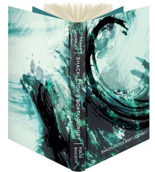
- The cover for Shackleton’s Boat Journey, the wave image for which needed to wrap around in an exciting manner. The colour scheme was selected with care to portray a fierce and stormy sea.
- Illustrations for Songlines, by Bruce Chatwin. Having read the book Simon proposed illustrations for certain passages - these are bold and stylised, reflecting Simon’s personal feelings on this extraordinary book.
Simon also produces limited edition prints and exhibits regularly.
Some Members have experience of Photoshop programmes or similar and Simon’s advice was to use your own sketches and artwork to form the backbone of the work, experiment with it, work quickly, keep making mistakes and enjoy it! He was thanked for taking us through his working practice and showing us so many exciting images which bring illustration and fine art together in such a professional way.
Workshop with artist, Paul Regan - Using photographs, without copying
13th March 2018
Paul Regan is the founder of Insight School of Art, North London, where he mentors professional practicing artists and teaches painting. His background is in Graphic Design and Illustration.
The hall was set out with three intriguing workstations and began with a short presentation of work by various artists who had used photographs as their starting points. These included David Hockney’s photo collages and Tracey Emin’s loose figure sketches.
This Workshop focused on using photographs as an inspiration for artworks and not in a literal way.
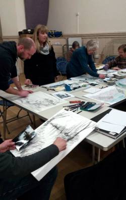
We split into three groups and as the evening progressed we worked through the exercises provided by Paul:
Group 1 - armed with bamboo poles, onto which a black market pen was taped we were asked to make a line drawing on a piece of A2 paper placed on the floor. This could be from a photograph or could be of figures, faces observed around us. This was a 5 minute task and the distance and lack of fine control was very freeing. After the initial “sketch” had been completed, we were asked to work into it with the various materials available. These included charcoal, crayons, chalks.
Group 2 - the collage table. Using coloured sugar papers we were tasked with making a representation a different photograph in torn or cut paper. Again, a short period for the initial collage, followed by enhancing this further with chosen materials. Some people had brought paints and these were used to good effect.
Group 3 was a novel approach. Working with a partner, one would give a verbal description of a photograph without the other having seen it. Thus the person drawing would be advised to make lines and marks as described in a general way by their partner. For example, to draw a line from the lower edge of the paper, halfway across to the right hand edge, halfway down. Then to draw a box shape in the centre of the sheet. Further instruction followed, again for 5 minutes or so. Only when the sheet had a “drawing” on it were we allowed to look at the photo being described. We then swapped roles with a different photo being described to the other party. Once this stage was completed both artists could further embellish their drawings with reference to the photo. The various outcomes were fascinating, sometimes bearing little relationship to the photos, occasionally eerily similar.
Throughout, Paul gave tips and advice. His guidance was to free up our imaginations during the process, moving away from the constraints of the original photographs by altering some of the elements, using a different colour palette, mixing the media etc.
This was a messy, challenging and very instructive Workshop, with each artist producing three very different works and experimenting with diverse approaches to the three set tasks. Paul showed enormous energy in working with such a large group (about 30) and was delighted with the outcome - as illustrated by the large collage of work at the end of the evening. He was warmly thanked for giving Members such an interesting evening.
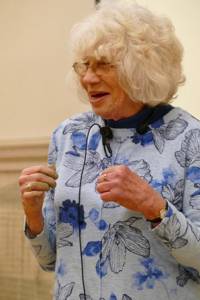
Painting with Pastels - Demonstration by Heather Brown
13th February 2018
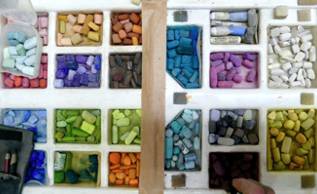
Mention Squirrels to most artists and they’ll think you’re referring to brushes; not so HAS member Heather Brown, whose one time pet, Cyril used to accompany her on country walks safely tucked in her pocket!
 Completely self taught, Heather has loved the countryside since childhood when she particularly enjoyed painting trees and sunsets and it was a rural scene she chose for her pastel demonstration.
Working on her favoured cream “Fisher 400”support, she lightly washed over her initial purply darks with water, softening the edges, having previously sketched out her composition in pastel pencil.
The sky was added in two shades of blue and a touch of pink, Heather explaining her enjoyment of being able to overlay and blend colours at will with soft pastel; Unison, Sennelier and Schminke being her makers of choice.
Building from the background forward and from darks to lights Heather uses a simple selection of shapers and brushes where needed but mostly manipulates the pigment with her fingers. She uses her photos purely as a starting point, adjusting each element to conform to her artist’s intuition.
With the basic painting in place Heather finally added some detail using seasonally correct flora references to introduce some contrasting colour to the finished piece. She then “framed” the image with a card mount, explaining that she always uses a double mount for finished work adding an extra strip behind the bottom edge to enable any displaced pastel to drop harmlessly out of sight, avoiding the need to use fixative.
Heather treated members not only to a first class demonstration but entertained us with stories of her early days as an artist culminating in being a long time member of the Society where she is proud to have had work accepted in to the Open Exhibition every time she has submitted – an enviable record, well deserved!
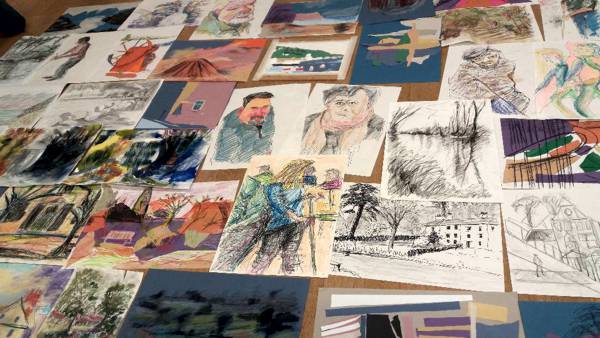
Still Life Workshop - Tutored workshop with Paul Curtis
10th February 2018
Paul is a professional artist who is based in London and Derbyshire. A Member and regular visitor to Hertford Art Society, he has tutored various workshops, often gives his advice at the monthly critique and has also been a judge at the annual Open Exhibition.
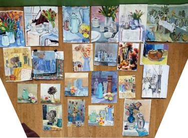
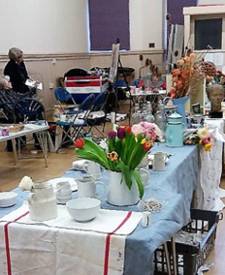
This workshop was well attended and we were greeted by a large and very quirky still life set up which ran the length of the hall. Our first task was to wander around with small paper squares and a pencil in order to observe the items and quickly sketch areas which caught our interest. This exercise encouraged us to look closely at the interaction of the objects on display, the negative spaces between them, and to observe the colours and textures of the items and the fabrics on which they rested. It was a good warm up and, after choosing our favourite sketch, with advice from Paul, we set up to paint or draw a larger version.
As this was an all-day workshop there was time to experiment. Most artists concentrated on one piece but several produced two or more images, perhaps torn between different interesting aspects of the still life set up. Some used watercolours, others acrylics and oils.
Throughout the day Paul circulated, giving each participant advice and suggestions, always bearing in mind the individual’s take on the subject. Some artists used a linear approach, progressing from a detailed drawing to painting, others tackled the task using only paint. Paul encouraged us to carefully observe the fall of light on the items, many of which were white. The many shades of white, from pale yellow, through blue to pale grey, were a strong feature of many of the artworks. Some opted for the more colourful items. Backgrounds were important and Paul suggested keeping the colour palette restrained and sympathetic to the objects portrayed. Strong darks were suggested here and there to give the paintings depth.
The day closed with a few minutes to sketch again the chosen snapshot of objects - these sketches proved looser and bolder than the originals. The completed work was laid out (as a form of collage) which gave an opportunity to see how others had approached this challenge. Paul reviewed the day and was delighted with the outcome. There was a great range of styles and individuality in the paintings. He stressed the importance of the initial sketches in refining ideas at the outset.
This was an absorbing and inspiring day. Paul was thanked for setting up such a vast and exciting collection of objects and for his untiring advice and encouragement through the day. We hope that he will be back for a similar workshop next year.
Birds of Prey - An opportunity to draw and paint three birds of prey presented by Kirsty Allen, Falconer
16th January 2018
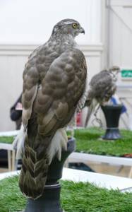
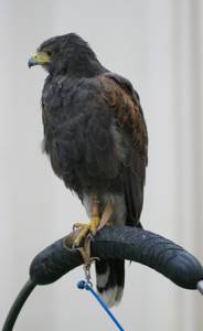
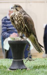
We were delighted to welcome back Kirsty Allen of Pennine Falcons, a very experienced and knowledgeable falconry team and breeding project based in the heart of the Pennines. Kirsty and her team offer a range of experiences with birds of prey at various locations. She regularly takes birds across the border into Scotland for exercise and hunting. Her birds are very well travelled and have made several TV and film appearances. For this evening Kirsty brought three birds which she introduced:
- Cassie, the Goshawk. She was in the recent BBC2 Natural World documentary with Helen McDonald. Goshawks are naturally very shy and difficult to spot in the wild.
- A Saker falcon, Nina. She is an Altai Saker from the Mongolian steppes.
- Luca, the Harris Hawk. This is a good starter bird for falconers, very placid and easy to manage.
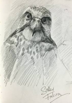
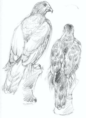
Left: Saker Falcon - Chris Baker. Right:
2 views of Goshawk - John Jarratt.
The birds had been set up in the middle of the floor. They were very calm and not at all phased by being asked to pose for sketches and paintings. Fortunately they returned to the same pose periodically so working on several drawings at the same time seemed to be the way to go. It was challenging but delightful to observe the birds so closely, they are powerful, alert and designed to hunt. Their markings and colouring gave Members plenty to explore. The sketches and paintings which resulted captured the grace and character of the birds.
Kirsty had visited us a year ago, in January 2017, and, as before, this practical evening was very well attended and welcomed as a very rare opportunity to draw such beautiful birds. Kirsty was warmly thanked for providing such a memorable evening.
A talk on Hans Holbein the Younger and a review of the BP Portrait Awards 2014 by Clare Gittings
19th December 2017
Portrait painting is a risky business!
Bad enough that your subject disapproves of your efforts but when several of your sitters have been executed for disagreeing with your boss, it takes things to a whole new level!
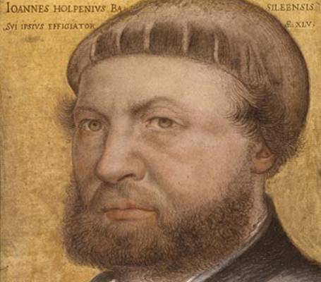
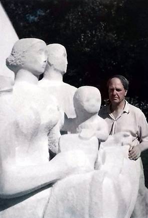
Hans Holbein the Younger, self portrait
In Clare Gittings excellent illustrated talk about Hans Holbein the Younger 1497 -1543 (Yes, there was an Elder) the life and times of this incomparable artist were brought to life with familiar and not so familiar images.
The painting of Thomas More for example ( just one of Holbein’s sitters who perished at the block ) is one most of us would recognise; less so is this beautiful drawing of one More’s daughters Ceciley Heron; a superficially simple study in black and coloured chalks which is so full of life one can imagine she is about to continue in conversation with the viewer after some momentary distraction. The sitter’s bodice has been loosened to reveal her yellow kirtle beneath, showing her to be pregnant. The drawing was a preparatory study for a group portrait of More’s family.
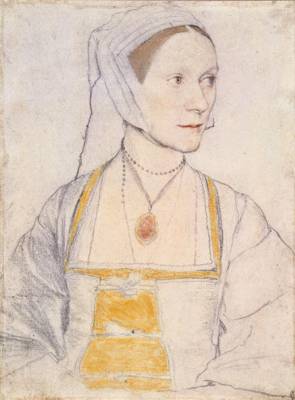
Ceciley Heron
Hans Holbein the younger was born in Augsberg, Southern Germany and was taught by his father, becoming a member of the Basel Artists’ Guild in 1519. He was married with four children but having painted his wife with two of their offspring in 1528 never saw them again, dying of plague in England in 1543.
He travelled a great deal and in 1526 made his first of two extended visits to England where he became Court painter to Henry VIII. It is largely through his work that we have become familiar with the faces of the great and sometimes not so good of Tudor England.
After his marriage to Jane Seymour, Henry commissioned a huge mural to decorate his Whitehall Palace which tragically was burnt to the ground in 1698. The only record we have is a the fabulous “cartoon” hanging in the National portrait gallery and a poor copy made in the time of Charles II illustrating how woefully inferior even Court painters were in those days; Clare explaining to us that, not only was there a dearth of home grown talent but that, even the likes of Holbein were treated and paid in much the same way as craft and tradesmen!
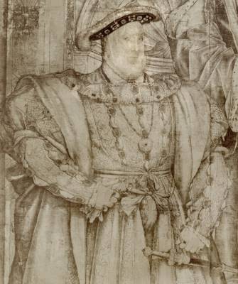
Henry VIII
The mural depicts Henry life size (6ft 4ins) and Holbein has made him intimidating both by exaggerating his physique but mostly by his expression – this is NOT a man to upset! Pity Holbein then when Henry commissioned him to travel to Flanders to capture the likeness of his newly intended, Anne of Cleves. Legend has it that on the strength of Holbein’s portrait, Henry decides she is to become wife No3 but when she arrives, Henry christens her the “Flanders Mare” and the marriage is dissolved in less than 6 months. Posterity does not record how Holbein got away with it!
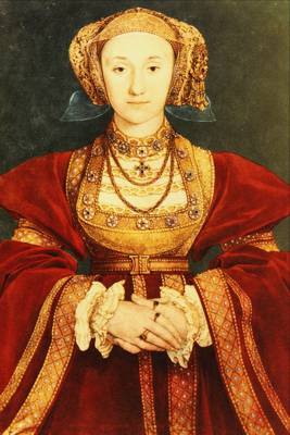
Anne of Cleves
Portrait painting is a risky business!
In the second half of Clare’s presentation we were invited to critique and judge some of the paintings from the BP Portrait Awards for 2014.
The annual exhibition regularly receives over 2000 submissions and the styles and techniques on show are as varied as the subjects. Unfortunately, due to copyright restrictions we are unable to reproduce any of the paintings here but you can find them at https://www.npg.org.uk/whatson/exhibitions/bp-portrait-award-2014/
Clare Gittings worked in the Education Dept at The National Portrait Gallery and is a regular, and very popular, guest speaker. Clare was warmly thanked for her presentation on the life of Hans Holbein the Younger and for her insight into the 2014 BP Portrait Awards.
Chris Baker
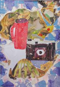
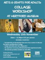
Collage Workshop at Hertford Museum - 15th November 2017
This was the last in a series of Workshops, led by artists from Hertford Art Society, which have run throughout the year in the well-appointed studio at Hertford Museum, 18 Bull Plain, Hertford SG14 1DT. Sara Taylor, Museum Curator, presented some well-known images from 20th Century artists who have used collage in their work. Collage truly emerged as a medium in its own right in the early years of the 20th century with the Cubist experiments of Pablo Picasso and Georges Braque who coined the term Collage (from the French: coller, "to glue). Many artists enjoy working in this medium and examples by David Hockney and Robert Rauchenburg were included in the presentation.
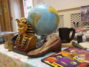
A still life had been set up using items from the Museum’s varied collection of artefacts as a source of inspiration. These included a globe and a Tutankhamen bust.
Participants began the session by sketching the still life set up with emphasis on bold forms and interesting contrasts and transferred their design to thick paper. Artist Kathy Burman gave advice on design, materials and techniques. Magazines and newspapers provide a huge range colourful and stimulating images and additional papers can be created using acrylic paint. Papers can be torn or cut to shape, layered and glued using PVA or wallpaper paste.
Gradually, interesting images began to take shape - some abstract, some with personal references. Unexpected results can result - using found materials in this way gives free rein to the imagination. The final pieces were colourful and exciting - referring to the items on display but in very personal ways. Some of the participants had experimented with collage previously - for others it was a new medium.
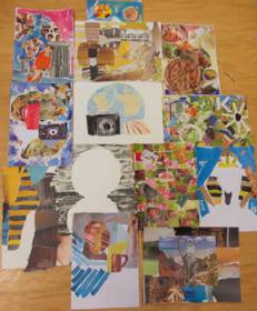
The earlier sessions in Watercolour, Printing and Clay Modelling gave participants an opportunity to gain new skills with guidance from artists and “try out” working in these various media. The Collage session was also very successful. A wide variety of styles and images resulted. These can be completed later and, perhaps, used as the basis of further artwork.
It is hoped that further art workshops will be organised in the future and there is always something interesting going on at the Museum for visitors of all ages. Check the museum website for details www.hertfordmuseum.org.
Deconstruction / Reconstruction
Workshop with Denise Allen - 7th November 2017
The principle of this workshop involved tearing up old paintings, rearranging and making a new image out of the pieces. The session was led by Denise Allen, an experienced artist who runs workshops and classes in painting with acrylics and watercolours.
Members were asked to bring along two or three paintings which they were prepared to tear up. These could be either watercolour or acrylic, preferably on paper. This was an ideal opportunity to reuse paintings which, for one reason or another, did not quite work out. The best paintings to choose for this are ones that have some structure in them. This could be buildings, people or objects. Also needed was a new piece of paper to work on, pencil or pen, Pritt stick or PVA glue, and painting materials, whatever medium the artist prefers.
Denise began by giving a short demonstration of the process, tearing elements of her chosen paintings and placing them with a view to composing an interesting juxtaposition of forms and shapes. These were then linked, imaginatively, with a fresh drawing. Paint was then applied to enhance the chosen colour scheme and bring the new image together.
Members then began to work on their own interpretation of this deconstruction/reconstruction process, enjoying the freedom to play around with selected parts of their own paintings and endeavouring to find a new, interesting composition.
Denise gave advice and guidance as the evening progressed. The resulting images were quirky and personal - with abstract qualities. Denise was warmly thanked for leading such an interesting session. This is certainly a good technique to utilise old work, either to make a finished piece or as a route towards a further painting.
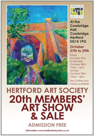
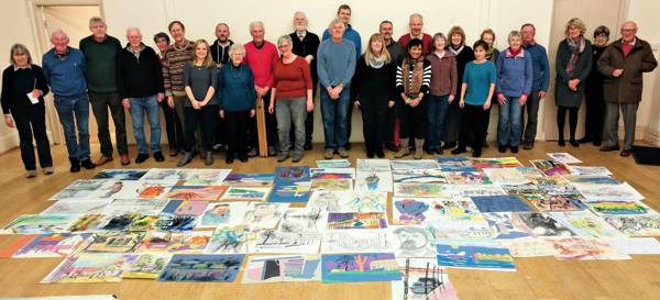
Art Society Members’ Art Show and Sale
27th - 29th October 2017
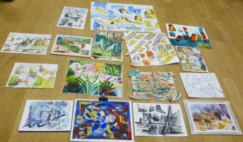
This was the 20th Members' Show and the third to be held at The Cowbridge Hall in Hertford. It was open over three days from 27-29th October (with a preview on the 26th) and showed work by 64 artists. Twenty two framed works were sold, also 11 unframed and 110 cards.
This is a show which is always a joy to visit, as our visitors regularly tell us. There is such a wide variety of subject matter and painting styles and the standard of work is high. So much to see - so difficult to choose a favourite (the Visitors' Choice voting box held over 225 votes!). The tea stall (offering home made cakes) at the back of the hall was a good place to sit and admire the paintings. There were portraits, like Anthony Parke's masterly 'Edward Lucie-Smith' and Sharon Wright's gentle and delightful portrait of an elderly person, 'Blue'. Glorious landscapes such as Rosemary Tinney's ' Burnham Overy Staithe' with its luminous sky, and Linda Radford's glowing watercolour scenes (she sold out!). Animal paintings, like Malini Croxson's extraordinary red and white zebras, 'Tangled' and Margo Ward's colourful and lively 'Hens in the Snow'. There was finely painted work such as Paul Swinge's 'Goldfinch and Pot' and Christine Flintham's 'Rosehips' and more expressionist work which describes the scene in a few expert brush strokes and colours such as David Quantrill's 'Carlton Marshes'. June Pickard's sculpture 'What on Earth' used an abstract form to describe the many textures and features found on the planet - fascinating: I wish we had more sculptors exhibiting! An unusual entry this year was a 3D miniature train layout with the countryside depicted (by Gillian Harman) in the style and colours of David Hockney, which created a lot of interest. At this stage I have to stop and apologise to all those artists who remain unnamed here. Their work was certainly appreciated.
Our prizewinners were as follows:
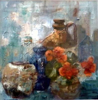
The May Bennett Annual Award for the best still life:
'Stella's Pots' by Sandra Edney Lynch.
A still life with harmonious colours and a rich surface.
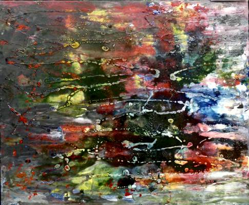
The Most Intriguing Work Award, selected by Mark Ely:
'Abstract' by Maureen Emerton.
Another very rich surface which drew you in to explore the shapes and colours.
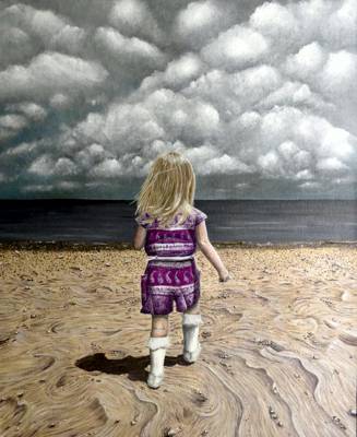
The Visitors' Choice Award:
'The Quiet before the Storm' by Alyson Sharpe.
A little girl on the beach, her back to us - a lovely image, beautifully painted.
The Members' Choice Award:
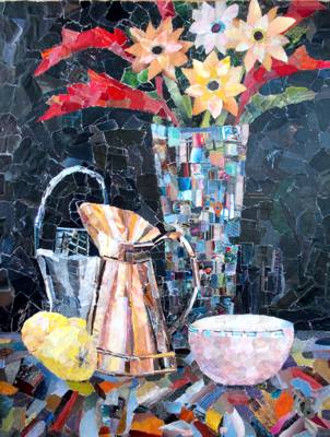
'Tabletop with Mosaic Vase' by Kathy Burman.
Kathy is a master of the mosaic-like collage and this was a lovely example.
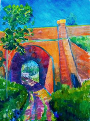
The Marie Goldsmith Annual Award:
for a Member with a consistently high standard of work who has served the Art Society well without formal recognition of their work or service: 'Tunnel at Stapleford' by Geoff Bennett.
This strong and colourful image graced our posters this year.
Of course, none of this would be possible without the help of so many Members of the Society, who worked long and hard to make the show a success. If you missed the show this year, make a note in your 2018 diary. We will be back again for the last weekend of October.
Frances Stevenson
Members' Show Co-ordinator
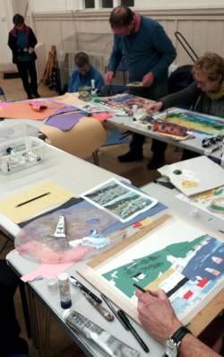
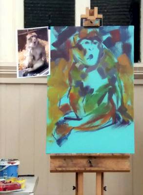
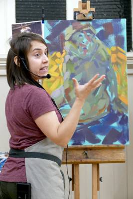
Wildlife Painting in Acrylics
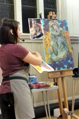
Demonstration by Marie Antoniou, Wildlife Artist - 17th October 2017
 Marie Antoniou won the BBC Wildlife Artist of the Year 2013 and has been a finalist or highly commended in recent David Shepherd Wildlife Artist of the Year Exhibitions. She contributes to Artist magazine and runs workshops in Essex and elsewhere. Her unique depictions of wildlife have earned her numerous awards and accolades. She enjoys using acrylics as they allow her to explore traditional subject matter in a more contemporary way.
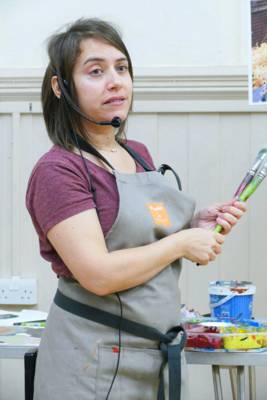
Marie introduced us to her kit. She uses a large lidded nibbles tray for her paints. This large tray is loaded with her chosen acrylics - 2 blues (Process Cyan and Cerulean), 2 reds (Alizarin Crimson and Cadmium Red), 2 yellows (Cadmium Yellow and Yellow Ocre) plus Burnt Sienna and Phthalo Green. The paint remains usable in this sealed tray for ages, she simply tops it up. Marie mixes colours on a large tear off palette and works with a variety of large flat brushes (both artist quality [Liquitex] and decorating brushes) from 4” to ½” wide. These give the expressive brush strokes which are her signature style.
Marie invites the audience to choose which image she paints and although the baby hippo was adorable, a photo of a barbary macaque was chosen. Her canvas had been primed with a strong aqua green acrylic. She has a variety of canvases ready to work on, all with bright or subdued primers - to avoid white and unify the finished painting where it is visible between brush strokes. She advises dampening the brush before use (to avoid the brush becoming clogged) and using very little water as this dilutes the paint. Using the edge of a 3” brush loaded with a strong dark purple, Marie marked the position of the monkey on the canvas with swift stokes and lines, indicating features and shadows loosely. With a larger brush the background was established with dark blues, purples and reds to vary the colours within the eventual shadows. Shadow areas were added to the figure. She added yellow strokes to indicate the position of the straw on which the monkey was sitting. Her approach is very much trial and error, risk taking and working with the surprises which result. Marie tends to use larger brushes to establish the groundwork and tones, with smaller brushes used as work progresses. She twists and turns the brush to vary the marks, working around and within the form of the figure, gradually building areas of light and dark. She leaves areas to dry, thus avoiding making the colours “muddy”. A crisp, fresh “portrait” of the macaque gradually begins to materialise. Highlights are added, defining the figure further while leaving the underpainting here and there to add depth.
Her working practices is to build up layers of marks, painting loosely and enjoying the process. She avoids using white as far as possible adding a chalky colour such as Yellow Ocre to the mixture. She begins with muted shades and “turns up the volume” later with bright tones and fresh clean brushes. Marie always works from her own photographs and regularly visits zoos and wildlife areas around the country, seeking out newborn rhinos or gorillas when the opportunity arises. She is passionate about the plight of endangered animals. In her work she tries to capture the essence of the animal and create something different, trying to express the wildness of the animal or bird, adding life to the painting with the large, lively brush strokes. Her bold use of colour gives a slightly abstract fe el to the work.
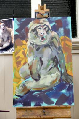
Marie finishes the demonstration by adding bright oranges, reds and purples to the straw and background, dark strokes to the shadows and adding white to the mixture to define the facial features of the monkey and final highlights to shoulder and leg, thus bring the image of the monkey forward. It really had great character and everyone enjoyed watching the painting take form.
Marie was warmly thanked for giving us such an exciting demonstration and for sharing her experience, knowledge and enthusiasm. Her painting style is brave and confident and should certainly inspire some of us to experiment with large brushes and bright colours in the future.
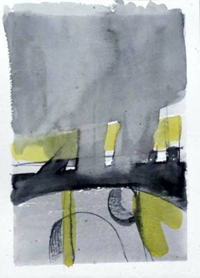
Abstract Art - What is it about?
Talk and Demonstration by Chris Tkacz - 10th October 2017
Chris Tkacz was welcomed and began the session with an illustrated review of Abstract Expressionism, the term applied to forms of abstract art developed by American painters such as Jackson Pollock, Mark Rothko and Willem de Kooning in the 1940s and 1950s. Many of these strange images were ridiculed at the time but have since opened doors in visual art.
The artists of the time drew on the work of previous masters. The world became smaller in the 19th century. Early 20th century artists were influenced strongly by the Impressionists, their lives and struggles. Van Gogh and Cezanne expressed themselves with bold colours and mark-making. Gaugin experienced primitive cultures. Primitive objects such as masks had a great impact on Picasso and his peers. Symbolic, spiritual influences from previously hidden places found a place in their artworks. Cubism emerged. Artists had a new language to explore. Mondrian took his initial tree sketches on a journey, abstracting them by degrees. They were simplistic but significant. Kandinsky, Malevich, Gorky explored in their art the rapidly changing new world, creating images about energy, force, colours, shapes, forms. In Britain, the work of Ben Nicholson, Barbara Hepworth, Peter Lanyon and their contemporaries leaned heavily towards abstraction.
Abstract Expressionism was the first specifically American movement to achieve international influence and put New York City at the centre of the western art world. Post-war, there had been an influx of European artists into the United States. The scale and size of the US made a huge impact and these visual and emotional experiences were synthesised in abstract images.
Chris is Art School trained, an experienced art tutor, runs workshops from his Derbyshire studio and works in various media, including egg tempera. The Derbyshire countryside with its beauty and dynamism have been a great source of inspiration in his art. He continued his talk with his own feelings about the abstract paintings which he creates. These are often childlike. He doesn’t know where the image is going and has no “plan” at the outset. Themes reoccur. Landscape has a huge influence with occasional figurative influences. Childhood memories, feelings, smells - these all figure in his work. Chris brought a variety of sketchbooks and paintings to illustrate his current work.
He often begins with a series of sketches, done quickly in watercolour to distil the elements of a scene. He paints en plein air and in the studio and allows time for paintings to develop and be reworked (often months or years!). He works primarily in oils (recommends Mike Harding colours) and adds layers of paint (often thinned with medium to aid quick drying). He has no idea of the eventual outcome, just makes a mark, a line, a shape, a form - judging each one against the last. He adds and substracts forms and colour intuitively in a subconscious, reactive manner. Using the palette to create just the right colour and shade is an important part of the process. He loves the names of certain colours, they create feelings and his work is all about feelings and responses. The canvas is a theatrical space, the edges important. Shapes emerge, forms created by illusion.
While talking about his approach, Chris “doodles” on a large square canvas then puts it to one side. He takes an old painting (mostly green trees) and begins overpainting, following some of the shapes within the original. He blocks in what might be an intense sky, then rotates the canvas which gives a totally different feel. Returning to the original canvas he refers back to a watercolour sketch as a starting point then adds some line and colour. Forms begin to emerge. Warm and cool colours create perspective and distance. A horizon appears. Glazing medium allows delicate layering of paint as the underlayer dries quickly, almost like watercolour technique in places. Bold scratching integrates one shape with another and adds texture. He picks up one of the earlier marks and adds a dynamic wavy shape. Each additional line or colour changes the relationships within the image and forces the artist to make judgements and move forward. At the end of the evening he invited participants to make some marks on his canvas. Neither of the demonstration pieces was finished, they were just used to illustrate his approach and techniques.
Members thanked Chris for a very enjoyable evening. The short history of the development of Abstract Expressionism was key as it, together with a more romantic English landscape tradition, shaped his work during his formative years as an artist. His very personal approach to creating abstract works was fascinating and inspirational. .
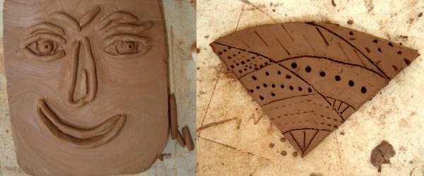
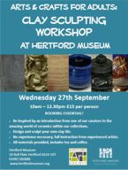
Clay Sculpting Workshop at Hertford Museum - 27th September 2017
The third Workshop in the series by Members of the Art Society at Hertford Museum was to make a relief on a tile inspired by an exhibit in the museum. This Workshop was led by June Pickard, Artist and Sculptor.
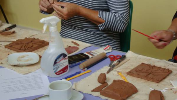
After the introductory talk on what to look for in the museums artefacts and having been shown examples of what could be done at different levels, the seven members of the public who attended looked around the museum to photograph or sketch items suitable for a relief. On their return the various tools and how they were used were explained.
When they had decided which design they wanted to use the outline was lightly etched onto a flat tile they had made by rolling out and trimming the air drying clay. Once this was done the serious work began by adding small pieces of clay to produce a raised image.
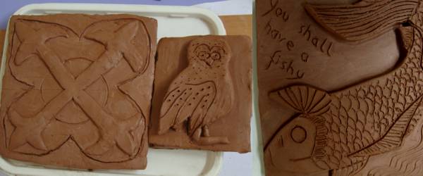
There was a large range of abilities from one person with experience who had prepared her design the night before, to others who had no experience at all. As they got more used to the medium and what effect different tools produced some got carried away and made more than one tile. The designs were bold and exciting.
Everyone was very enthusiastic and even the organiser joined in. They all left happily with their pieces saying they would like to do more.
This is a marvellous way to further the popularity of the Art Society and, needless to say, mention was made of the Members Show which will be held at Cowbridge Halls, Cowbridge, Hertford on 27th to 29th October and the Collage Workshop which will be held at the Hertford Museum on 15th November.
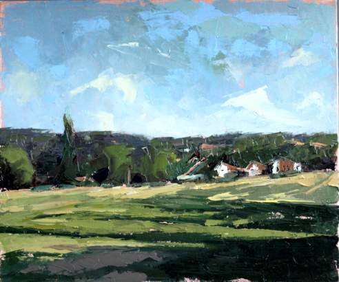
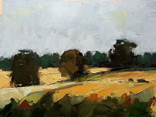
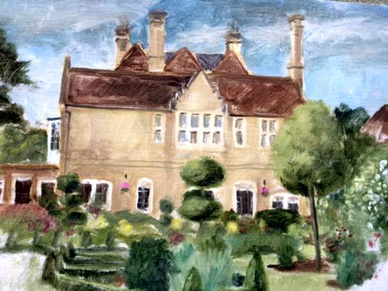
Summer Programme Review 2017
- 2017sep-summer-review-stephen-lowe.jpg
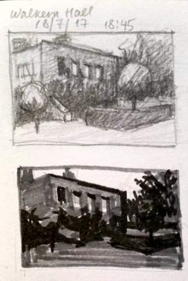
Stephen Lowe, Walkern Hall - Oil on board - 25 x 15cm
- 2017sep-summer-review-craig-lee-01.jpg
Craig Lee, Across the fields of Bengeo, near Port Hill - Oil on panel - 30 x 25cm
- 2017sep-summer-review-craig-lee-02.jpg
Craig Lee, Beside the Mill, Westmill, Ware - Oil on panel - 25 x 30cm
- 2017sep-summer-review-craig-lee-03.jpg
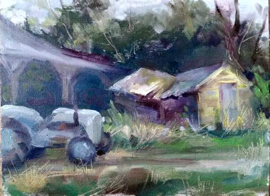
Craig Lee, Essendon Place Farm - Oil on panel - 20 x 15cm
- 2017sep-summer-review-craig-lee-04.jpg
Craig Lee, One of the Three Lakes, Westmill - Oil on panel - 20 x 15cm
- 2017sep-summer-review-craig-lee-05.jpg
Craig Lee, River Lea, St. Margarets - Oil on panel - 30 x 25cm
- 2017sep-summer-review-craig-lee-06.jpg
Craig Lee, Three Trees, Walkern Hall Estate - Oil on panel - 20 x 15cm
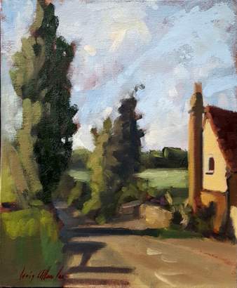
- 2017sep-summer-review-john-jarrett-01.jpg
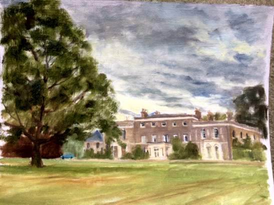
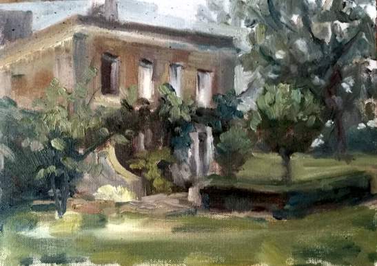
John Jarrett, Bengeo Hall
- 2017sep-summer-review-john-jarrett-02.jpg
John Jarrett, River Lea at Stanstead Abbotts
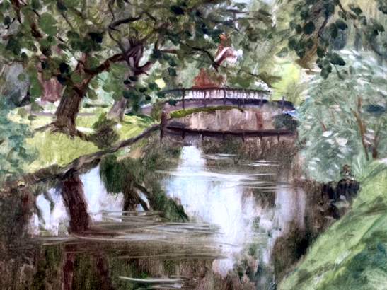
- 2017sep-summer-review-john-jarrett-03.jpg
John Jarrett, River Lea in Hertford Castle Grounds
- 2017sep-summer-review-john-jarrett-04.jpg
John Jarrett, Walkern Hall
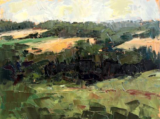
- 2017sep-summer-review-oksana-melenevska-01.jpg
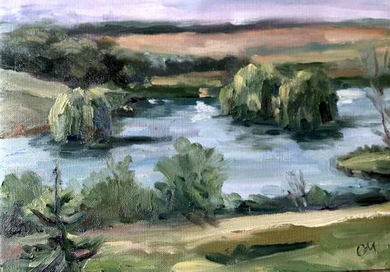
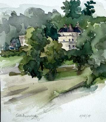
Oksana Melenevska, 3 Lakes Westmill Farm - Oil - 25 x 18cm
- 2017sep-summer-review-oksana-melenevska-02.jpg
Oksana Melenevska, 3 Lakes Westmill Farm - Oil - 25 x 18cm
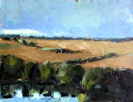
- 2017sep-summer-review-oksana-melenevska-03.jpg
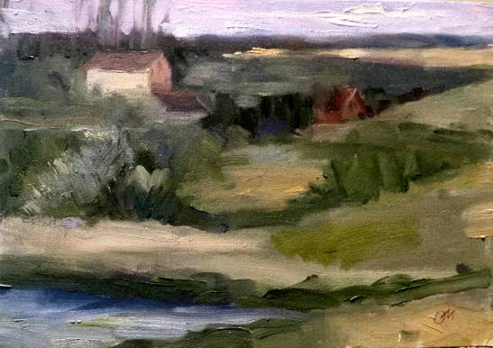
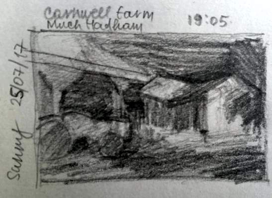
Oksana Melenevska, Carnwell Farm Much Hadham - Oil - 25 x 18cm
- 2017sep-summer-review-oksana-melenevska-04.jpg
Oksana Melenevska, Newgate Street Village & Ponsbourne Park - Watercolour - 18 x 25cm
- 2017sep-summer-review-oksana-melenevska-05.jpg
Oksana Melenevska, Walkern Hall Estate - Oil - 25 x 18cm
- 2017sep-summer-review-oksana-melenevska-06.jpg
Oksana Melenevska, Sketche
- 2017sep-summer-review-oksana-melenevska-07.jpg
Oksana Melenevska, Sketche
- 2017sep-summer-review-oksana-melenevska-08.jpg
Oksana Melenevska, Sketche
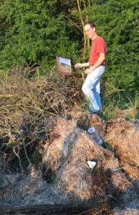 Each summer Hertford Art Society Members enjoy painting and sketching out of doors on Tuesday evenings at various venues in the Hertford Area.
This year’s programme included familiar locations around Hertford and Ware and featured (by kind invitation) visits to The Garden of the Mill - Westmill, Bengeo Hall, Essendon Place Farm Stables, Walkern|Hall Estate and Carnwell Farm - Much Hadham.
The weather was mostly kind (one rainy evening involved three hardy artists and a longer than usual session at the pub) and the variety of venues provided some exciting sketching and painting opportunities.
A new Member of the Society, Oksana Melenevska, comments:
“Not so long ago I joined HAS and cannot stress enough how fortunate I am. The Summer Programme was organised in the best possible way with the variety of the picturesque spots round Hertfordshire.
As the time is limited (about 2 hrs) it has giving me a chance to practice a looser approach that's as much about the paint as the subject. Exploring the paint and reacting to your surroundings was such a fun! At the same time it's a great way of warm up for more serious work that can be continued back in the studio.
Painting outdoor with the fellow artists also is a great opportunity to be encouraged just to sketch and keep on being a sketch hunter as it's the most effective way to train your eye and hand which is essential.
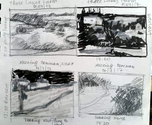
These are my Notan quick drawings which I always do before starting to paint.
Happy painting everyone!
Whats is Notan:
The Japanese use the term 'Notan' to describe an important element of design. Notan means dark versus light harmony. The Japanese concept of two value Notan uses the simple concept of contrasting light and dark shapes.”
Art Workshops at Hertford Museum
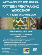
14th June 2017 - Printmaking with Geoff Bennett
27th September 2017 - Clay Sculpting with June Pickard
15th November 2017 - Collage with Kathy Burman
In collaboration with Hertford Art Society, Hertford Museum is running a further series of Art Workshops during 2017. These Workshops will use the exciting and varied range of artefacts available at Hertford’s Museum as a starting point for the design of the finished article and are suitable for beginners and those more experienced. The first session, on Watercolours, was run by Denise Allen and was a great success. The downloadable leaflets give full details of times, cost etc. Booking is directly with Hertford Museum - www.hertfordmuseum.org (Tel: 01992 582686)
- General leaflet (pdf) - click here for more details.
- Printmaking (pdf) - click here for more details.
- Clay sculpting (pdf) - click here for more details.
- Collage (pdf) - click here for more details.
Haydn’s Mass and Te Deum - All Saint’s Church, Hertford - 1st April 2017
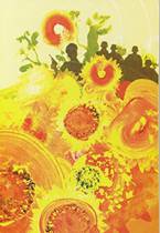
The Art Society was once again invited to illustrate Hertford Choral Society’s Spring Concert – Haydn’s Mass and Te Deum. This is a tricky score to illustrate – the works contain devotional phrases familiar to us all but few descriptive terms that readily transform to figurative pictures.
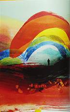
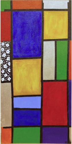
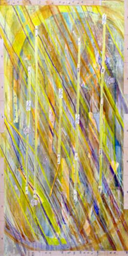
Persis Limbuwala did the sensible thing and painted an abstract of ‘Heaven and Earth full of the Majesty: of thy Glory’ - a Mondrian-style image of colourful panels edged in black which gives the picture a stained glass effect, entirely appropriate to its church setting.
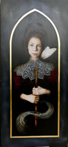
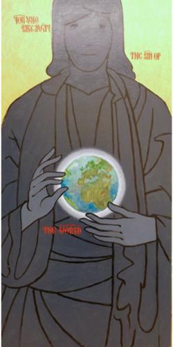
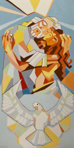
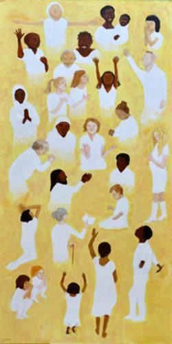
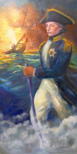
Jenny Stratfold worked in a human theme with a panoply of worshipers from different lands to convey ‘The holy Church throughout all the world doth acknowledge Thee’ and Geoff Reynolds also decided to go for a group of people to illustrate ‘We praise You, we bless You, we worship You, we glorify You’. Paul Swinge created cubist images depicting ‘You alone are the Most High, Jesus Christ with the Holy Spirit in the glory of God the Father’; John Jarratt selected just one of the Holy Trinity but was able to add in Planet Earth to illustrate ‘You who take away the sin of the world’. Sarah Merry painted ‘Light through a stained glass window falling on the music of the Te Deum’ and Oksana Melenevska, a newcomer to the Art Society, cleverly took her cue from the title of the piece – The Lord Nelson Mass – and showed Nelson resplendent in his naval uniform with a French frigate burning in the background. For all of us creating images to illustrate the Choral Society’s Spring Concert is an annual challenge, privilege and pleasure. And it brings with it an invitation to all members of HAS to come along to the final rehearsal on the afternoon of the performance to draw or paint the orchestra, soloists, choir and conductor: there never was a better chance to get up close and personal to a large scale musical event, free to capture the folk at work, great music swirling around you. |
|
The large scale pictures were much appreciated by a packed audience on the night of the concert and for a month afterwards as the vicar of All Saint’s Church enjoys keeping the pictures hanging in the church for her subsequent congregations to take in.
Archive PROGRAMMES
Winter 2017-2018 programme
Summer 2017 programme